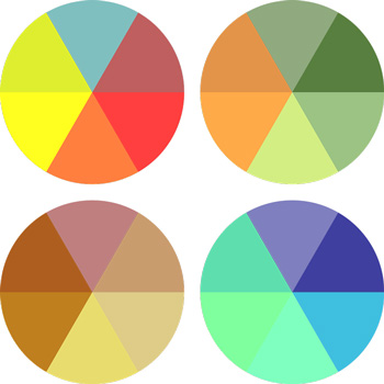
Colour is a great way to communicate with website visitors, especially on an emotional level. Without them even being aware, the chosen colours of a website create certain moods in the user. While colour can be the best way to create an immediate impression, the difficult part is employing colour combinations while maintaining a polished and unified appearance.
There are a number of methods that can be used to create a colour combination. Here is one that has successfully been employed by numerous websites:

Start with the End in Mind
Colour can be highly effective when used to elicit emotion in someone. So, if the goal of a website is to sell, you should choose colours to achieve just that. Brand managers and market researchers use colour psychology in order to influence the user to engage with the product.
Daily Deal Websites
Daily deal sites often use bright colours. The Groupon colour scheme creates a sense of urgency. These websites are based around the concept of grabbing a deal and bright colours make sense for this kind of game-like appeal.

Groupon logo by Groupon, Inc. (Creative Commons Attribution-ShareAlike License)
Hospitality
Hotel websites tend to have a colour scheme of blue, white, green, or black, due to the symbolic suggestions these colours represent. They also use warm colours as they elicit a feeling of comfort. Restaurants have an inclination towards warm colours: typically orange and red. They also like to use bright colours, drawing from the food when possible, to create visual harmony.
iGaming
Most casino websites employ a tone blend of red, blue, or green or an elegant simple combination, such as silver and red or gold and black. Even the online casino comparison sites adopt similar colour themes to the companies they represent, such as Paddy Power. While they may seem tempting enough on their own with the welcome bonuses they offer – the latter site gives out a £500 bonus – the right colour scheme never hurts.
Colleges
College websites are content-heavy, which can be a challenge, design-wise. The Camden Military Academy employs bold, universal colours to create a feeling of reliability and trust. The website uses red and yellow with a number of tints to differentiate the various pieces of content.
Carefully considered colour schemes, along with shades and tints, will create different reactions, feelings, and moods in the visitor. Only by viewing lots of various website designs will you develop your sense of colour.


