For a website of any kinds and sizes, there are two main components – blog posts and overall design. Generally, the majority of webmasters pay much attention to the content as it directly affects how readers and search engines view their website. But in fact, the design simply has the same level of importance.
Frankly, the overall style of your webpage is the first thing people will see when they enter into your website. Therefore, if your design can attract them, your page bounce rate can be reduced greatly. Also, if you website is designed with clear layout, searching spiders can crawl your content easily.
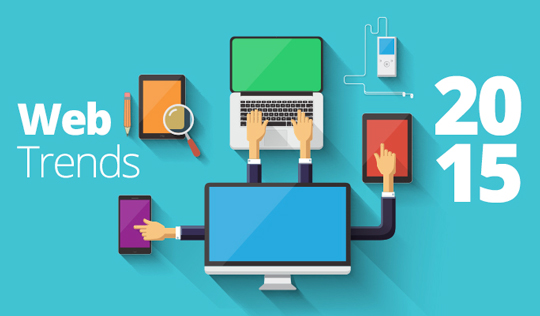
Due to the crucial nature of website design, we’d like to list the top 6 design trends in 2015 based on our online researches. Note that these tips are better for WordPress powered site, and can also give you some inspirations if your site is build using other CMS.

Tip One: Use Responsive Templates
In the very beginning, you have to make sure that the template you use is 100% responsive, no matter whether it is a self-made one or is downloaded from some third parties. This is because we are living in a digital world, and people not only use computer or laptop to surf the internet. Instead, more and more online users prefer to use the smartphone and tablet as they are easy to carry. Therefore, you have to guarantee that web content can be displayed in a proper way on these viewing devices. And this can be achieved by the utilization of WordPress responsive themes .
Tip Two: Start a Landing Page with Animated Images
At present, more and more webmasters prefer to start a landing page for their websites. The landing page does not have to include so many contents, but only a full-screen image along with a few simple words that are coming with the bold fonts and can summarize the main thesis statement of the whole site using some attractive descriptions.
Besides, you can locate a sign in channel, registration channel and a contact channel at the corner of this page, so that your readers can join your online communication easily.
In fact, instead of a large and static image, webmasters are more likely to use an animated one that can work some flashes automatically with a proper interval. To be frank, this kind of landing page can better arouse people’s interest to move on.
Tip Three: Use Big Pictures Instead of Small Ones
If you have noticed the design trends of iPhone and Samsung, you can find that the big screen is better adopted than ever before. This is because the large item is more preferred by people nowadays. As for the website design, you can find that many official sites like HostGator, BlueHost and HostPapa choose to use multiple large and full-screen images to replace the original small and rectangular ones.
Therefore, here, we highly recommend you to use a full-screen image as your background image and large photography as your featured image. However, you should guarantee that the images you choose are of high quality and HD.
Tip Four: Add the Video Section and a Sidebar
The video section and sidebar area are two of the most popular components for a website nowadays. The former one can add more diversity to your web content while the latter one is the best option to locate some of your minor information, such as the advertisements, the latest post display and the excerpts of hot comments.
As for the placement of the components, we highly suggest you to locate both of them at the right hand, with the video player putting on the upper place. Note that they need to be below to your header and have the same width.
Tip Five: Card Design for Photo Gallery and Flat Design for Multi-Category Site
Generally, different kinds of websites have different design trending. For instance, it would be better for a photo gallery site to adopt a card design and a multi-category site to use the flat design.
To achieve this goal, you may need some coding stuff. Or, choose a proper template from WordPress resource sites like WhatsWP and WordPress.org for downloading and installation.
Tip Six: Remember to Add Some Minor and Functional Buttons
This aspect cannot only better beautify your webpage, but also improve the reading experiences for your readers. Here, we mean you can adopt some attractive, unique and obvious buttons coming with the proper sizes for different functions, such as read more buttons, scrolling-over buttons, learn more buttons, and follow-us buttons.


