Creating a marketplace is not an easy task. You need to have an exciting premise, a clear target audience, perfect technical realization, an accessible interface, and a smooth customer experience. A lot to think about, isn’t it?
While functionality is often prioritized and in most cases sufficient by itself, design solutions are not always that perfect. Let’s look at typical UI and UX design problems and how to solve them.
Typical marketplace problems
Apart from bugs and other technical issues that might bother users, there are also nontechnical issues that can discourage them from becoming your customers. Most of these are user experience (UX) design issues that require consideration before the design implementation. Even with such proactiveness, many marketplaces nevertheless suffer from the same fundamental problems:
– 1. Lack of trust: Users are unlikely to buy a product without a high-quality photograph of the item. Similar trust issues arise when people don’t know the seller’s identity, how the product is shipped, and how payments are processed. An even more significant concern is when consumers are unsure about return policies and warranties, which are influential in decision-making.
– 2. Poor user experience: When users shop on a marketplace, they expect high quality and convenient self-service. If your marketplace overloads users with complicated forms, involves navigating numerous pages and buttons, and results in a lengthy process to place an order, potential customers are likely to abandon their carts without making a purchase.
– 3. Wrong target audience: Lastly, it’s vital to know everything about your target audience and use this knowledge to make your website and mobile app relevant for them. Without this market awareness, you risk missing out on valuable opportunities to increase your revenue.
Let’s discuss how to best avoid all these problems at the design stage as an ecommerce marketplace developer. Below, we highlight some approaches and best practices toward addressing these issues.
Design solutions
Many problems that result in decreased revenue for marketplaces often could have been prevented in the early stages of development with little effort.
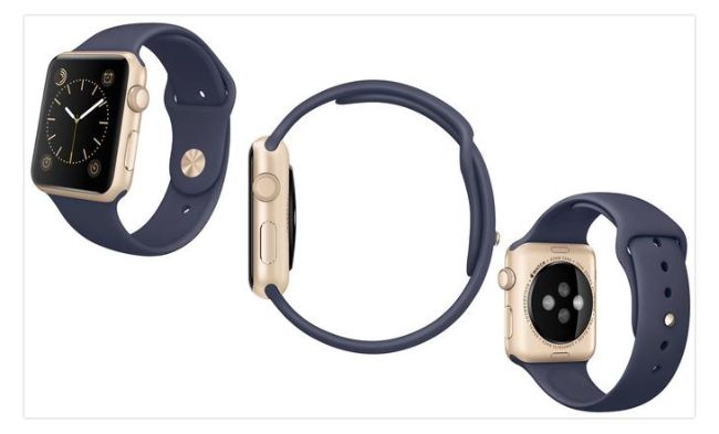
 Amazon provides detailed high-quality pictures from multiple angles
– Images and descriptions
The most important considerations for users when shopping for any product are clear images and detailed item descriptions. Before committing to a purchase, every customer expects detailed information about the product they’re viewing. Accurate photographs and videos displaying merchandise from all sides are helpful.
Knowing the item size is also crucial for many categories of goods. Consider coupling pictures of a product with other objects of a specific size so users can easily compare them.
Item descriptions are also significant. The more a user knows about an item, the less likely they’ll buy a good in error and seek a return. From a development perspective, provide relevant description fields and encourage your sellers to fill them in when listing products. For example, these might include material, size, color, and any other basic identifying information.
When users have all the answers, they’re less likely to hesitate when making a purchase.
– Access to information
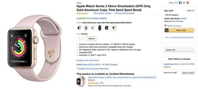
Information can have a tremendous impact on users’ trust toward your marketplace. Among the most important types of information to have easily available are shipping policies, warranties, return and refund policies, and information on sellers.
Background information on sellers doesn’t increase trust in the marketplace directly, but it does build trust between buyers and sellers, which can help increase sales. People like to know where their products come from, who is responsible for them, and whom to address if something goes wrong.
What is more dependent on the ecommerce marketplace itself are clear shipping conditions and other policies that inform people before ordering so they are less likely to cancel their order.
One more crucial consideration is ratings. Whether for products, sellers, or even buyers, ratings give transparency to all participants and make it more likely for a successful deal to take place.
 Amazon provides detailed descriptions and shipping costs
– Pleasant customer journey
When developing any product, you have to think about the customer journey in advance. Define all actions the customer might take and all the goals they want to achieve with the help of your service.
The customer journey must be both satisfying and convenient. All interfaces must help the user complete target action and get what they want. Creating a user journey map can help during this process.
A proven way to evaluate user journey is to perform usability testing. Usability testing allows you to get feedback on your marketplace and make sure it is convenient and helpful. If your UX design has problems, testing will identify them so that you can fix them and gain a competitive advantage.
If you’re inexperienced with this process, it’s best to turn to professionals. Find a web design company that will create a UI and UX design according to your specific needs.
– Defined target audience
Defining your target audience in the early stages of product development also helps you determine the right design features you might wish to incorporate. This will help you find out the preferences of your target audience and the reasons for their actions. Data on your target audience will help you develop an even better user experience, resulting in higher marketplace revenue.
Conclusion
Design enhancements alone can dramatically multiply a marketplace’s revenue. However, substantial changes require time and money. If you’re beginning to develop your marketplace, it’s advantageous to consider all the issues we discussed in advance. We recommend involving professionals in your user experience development in order to guarantee the best results.


