In the 1980s, the quick-cut editing style of the TV show Miami Vice shortened viewers’ attention spans for scripted television. Nowadays, the vast information wilderness of the Internet has an equivalent effect on visitors’ willingness to stay longer on any individual site.
Attractive, distinctive web design, matched with useful, interesting content, becomes the key to building a site that holds the viewer’s attention.
But whiz-bang, hyper-animated user interfaces have given way to simpler styles that feature flat looks devoid of the juicy, dimensional looks of a few years ago.
Perhaps designers finally realized that sometimes, less really is more, especially when this helps showcasing content rather than competing with it.
You can point to many reasons for the changing face of online design, from fading trends superseded by new fads to a desire to minimize, if not eliminate, the use of bitmapped graphics to create interface elements.
Now that CSS can build many, if not most of the glows and gradients, fades and faceting that previously meant loading in GIFs and JPEGs to create a look, designers reach for typefaces to build elements such as buttons and decorations.
Here are 9 interface options that I strongly recommend.
Minimalism
Web 1.0 bristled with blink tags, gratuitous gradients, bitmapped headlines, and more doodads per square inch than a souvenir booth at a tourist attraction.
Look at minimalism as the antidote to distractions.
Text-based buttons load faster than bitmaps. For interface elements, GIFs and JPEGs can give way to SVG files that minimize the data size of Web pages.
Simplicity helps put the spotlight on content.
Animated Concepts
Just as bitmaps become less prevalent in interface design, they make a comeback in a realm in which they long ago lost out to video footage. The animated GIF has returned as a means of displaying short segments of motion and creating humorous imagery.
Sports websites such as Bleacher Report use GIFs to showcase football and basketball plays.
Designers use these GIFs to build low-bandwidth animated portfolios that promote their website themes, demonstrate the gestures that navigate through their mobile apps, and visualize their menu designs.
Flat UI
When Apple launched the original look of OS X, the late Steve Jobs famously told a preview audience that he insisted on an interface that looked good enough to lick.
Many of the dimensional elements that made up OS X debuted as interface styling on the Apple website.
Today, the same site reveals the newly flat look of iOS and OS X, stripped of the gradient-based buttons, deliberately lifelike textures, and pseudo-realistic shadows people learned to associate with Apple’s style.
Just as the lick-able look of OS X permeated the Web, so has the flat look become a trend to replace it.
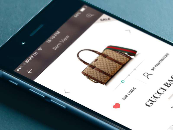
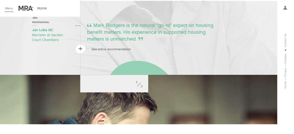
Card Layout
The prevalence of blogs helped spawn the movement from content management systems to full-website development based on the same CMSes.
From Pinterest to Tumblr, modular sites now rely on small groupings of information incorporating a visual accompanied by a teaspoon of text.
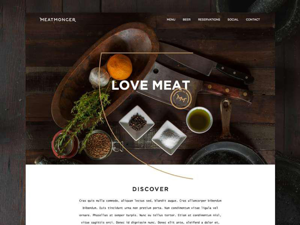
The same kinds of cardlike layouts combined in multiple columns work equally well for portfolio sites and for some forms of news presentations, including pop culture showcases
Skeuomorphism
After Apple incorporated realistic textures – brushed metal, stitched leather, woodgrain – into its OSes and apps, the trend toward imitating traditional real-world elements in online design took off like a rocket.
It gained so much popularity that the $10 word that describes it became a part of regular daily discourse: skeuomorphism, or the emulation of the analog world in the digital realm in the service of making functionality more intuitive.
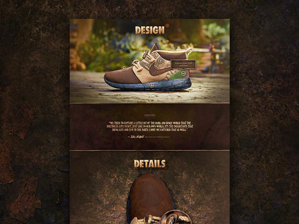
After Steve Jobs’ death, Apple began to move away from skeuomorphism to flat design. Among people who design user interfaces, skeuomorphism earns either a badge of honor – realistically presented in pretty pixels – or a mark of shame.
Proponents point to its ability to create an accessible, attractive look, while detractors say it makes about as much sense as creating a steampunk MRI machine, as it brings the negative baggage of traditional objects into a world that doesn’t need it.
To avoid excess, save skeuomorphism for applications in which it gives the user an experience that mimics the analog world in a positive way, on a tablet or smartphone touchscreen, for example.
Typography
Now that real typefaces dominate the Web, and the old days of default fonts have given way to paid and open source typography, you’ll see even more proof that sans-serif designs work better for online body copy than serif type does.
One of the Internet’s dominant typefaces is designer Mark Simonson’s elegant Proxima Nova, a huge sans-serif family in three distinct widths.
Apple’s enhanced reliance on lightweight sans-serif type in iOS and OS X also helps reinforce the sans-serif trend, along with debates over how thin is too thin for readability.
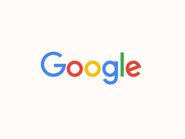
Most recently, Google’s logo redesign also highlight that sans-serif do dominate the current web design trends.
Ghost Buttons
Why slap a screaming-red, drop-shadowed, embossed call-to-action button on your website? You can stay true to minimalism with a transparent, all-but-weightless CTA that consists of thin type and an equally thin outline.
These odes to simplicity carry less-is-more into a realm formerly dominated by blindingly obvious bitmap-based clicks.
A subtle whisper replaces thus a boisterous shout.
Collapsing Content
When your website requires large amounts of copy or long lists of links to other content, corral clutter with collapsing designs that hide and show material when a visitor clicks on a “More” button.
This gives you the best of two worlds, with a clean, minimalistic presentation that offers more detail through a simple, intuitive peekaboo process.
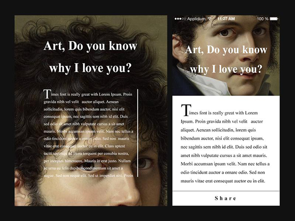
Content Chunking
Sometimes what’s new isn’t new; it’s simply rediscovered.
Chunking divides up longer copy into sections preceded with subheads and bordered with imagery. It’s one of the oldest ideas in the book, from print material to early Web designs.
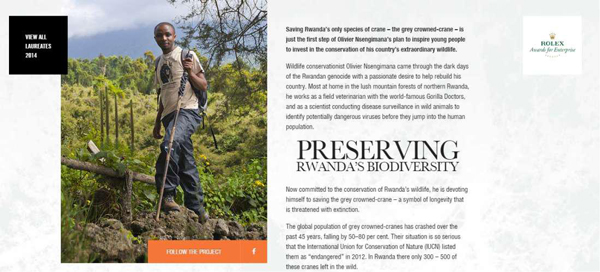
Coupled with new, attractive minimalist approaches, it combines easy readability with a monotony-busting look that’s easy on the eyes.
Conclusion
Distinguishing your company website or setting yourself apart as a mobile designer takes careful, progressive attention to interface design.
Online and in apps, well-crafted interfaces entice users into the experience you want to create and succeed in keeping them there for longer periods of time.
Pay as much attention to interfaces as you do to trends and you can elevate yourself into the upper echelon of design talent, with abilities that buoy your career past fleeting fads.
Liz Mertens is a passionate UI and web designer who also writes great design articles. You can tweet her or connect with her on LinkedIn.


