Welcome to this tutorial for showcase style brochure designs. In this special article, we will give you the specific steps needed in creating a showcase style brochure using Adobe Photoshop. A showcase style design is meant to feature of course one major product or service. It is not just about inserting pretty pictures of course. It is about melding the right elements for an impressive color brochure. So let us get started.
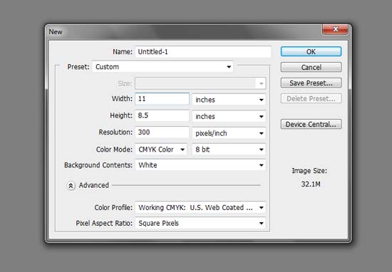
1.The first move is to create a good document for brochure printing in Photoshop. Now, there are several types of standard dimensions that you can use. In this guide though, we will use a landscape oriented letter-sized document setup so that even amateurs can print your design using a standard sized printer and letter paper if need be. Of course, if you have a professional brochure printer in mind, then it is best to use their dimensions. For the basic dimensions though, here are the settings you should put when you create a new document.
a. Width: 11 inches
b. Height: 8.5 inches
c. Resolution: 300ppi
d. Color Mode: CMYK (check with your printer though)
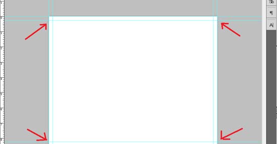
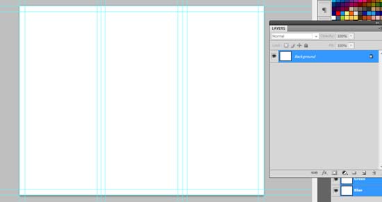
2.We will now add some guidelines. First we will add some margins. Bring up the rulers by pressing CTRL+R. Then from those rulers, click and drag some guidelines into place. Insert in guidelines (1/4)0.25 inches from the edge of the document. Also it would be good as a preparatory step to also place guidelines at the exact edge of the document (this will be useful later). Once done, you should have something like this:
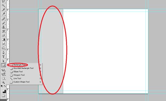
3.Next, we shall divide the paper into 3 equal parts. Notice of course that dividing 11 by 3 results in an irregular number. So it is hard to be specific about it with the division guidelines when you do it manually. To easily do this, we will use some rectangles and scaling. First, use the rectangle shape tool and just create a rectangle that spans the height of the document. The color does not matter.
4.Press CTRL+J once to duplicate the original rectangle. Use the move tool (shortcut V) to place it beside the main rectangle. Change its color. Afterwards, repeat the process again to get a final tally of 3 rectangles of different colors. In our example, we used different shades of gray.
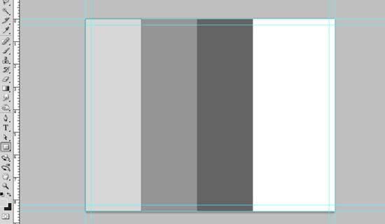
5.Select all the rectangles by holding the CTRL key and then clicking on all of them in the layers panel. Then, press CTRL+T to enable transformations. Afterwards, click and drag the right side anchor box and drag it to the right. This will give us equally spaced rectangles on the document.

6.Now, click and drag guidelines to match the divisions of the rectangles. Then (if you want), also add security margins that are (1/4)0.25 inches from these division guidelines. This allows us to get the basic guideline setup for a trifold brochure. Once setup, delete the rectangles that we created as they are not part of our design actually.
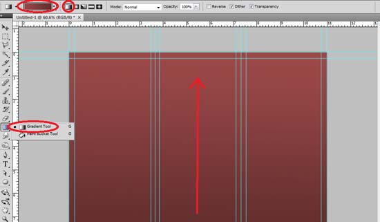
7.Now, we setup the background. Use the gradient color tool to apply a linear gradient across the whole background. Drag it vertically to get a top to bottom gradient. Make it so that the lighter color is on top. Remember that you can set the color combination of the gradient by clicking on the gradient color box on the options bar once the gradient tool is activated. Just set it to two related colors of course.
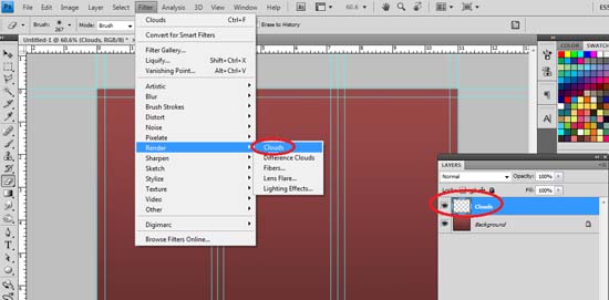
8.Next, we create a new layer by pressing CTRL+SHIFT+N. For this example, we name it “Clouds”. Then, make sure you setup your foreground and background colors to the gradient colors you setup earlier. You can set this up by clicking on the foreground and background color boxes below the tools panel. Once the color is correctly setup, go to Filter -> Render -> Clouds.
9.You should then see clouds rendered in the colors you set. Press CTRL+T to transform this layer and shift it so that the clouds only appear on top of our background. Once it is setup at the top, press enter to apply the transformation.
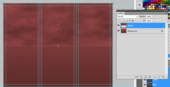
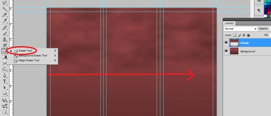
10.Then use a large and soft eraser brush to smoothly erase the bottom part of our cloud layer. This lets it integrate better with the original background. Once, done save our document.
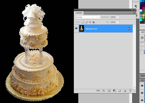
11.Great! We are now ready to add the content elements unto our design. Our first move is to place in our feature showcase image. This will be your product or service. In our example, we are going to use a cake image from morguefile here: http://www.morguefile.com/archive/display/48180. Before we paste in the image though of course, we remove its background. Using the magic wand tool, we select the black background. Then, we press CTRL+SHIFT+I to invert the background selection to the cake.
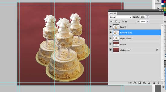
12.Now, we copy-paste the image unto our brochure design. We scale it properly to size by pressing CTRL+T and then holding the SHIFT key as one drags the anchor points for resizing. We place it a little bit off-center. Technically, you should not be placing images on the fold markers and guidelines. However this is a showcase type design, meaning it is meant to be viewed as a whole open brochure, so it is okay to do this kind of positioning.

13.Next, to make it look like a feature, we duplicate our cake two more times by pressing CTRL+J twice. Of course you can get other product images to accompany the main image. If this is what you want, then you can copy-paste and scale in those images. Whatever the case, for our example, we use the duplicates representing more of our product. We then scale them to be a bit smaller since they are behind our main image.
14.Next, we will add some shadows. For this, we create a new layer by pressing CTRL+SHIFT+N. We name this layer “Shadows”. Then we hold the CTRL key and then click on the main cake image. This will select its area. With the new layer selected, fill this area with a dark theme color. NOTE that the active layer must still be the new layer while the selection comes from the main cake layer. Once we turn off the visibility of the main cake layer, it should look like this.
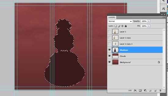
15.We then erase the top part using the eraser tool.
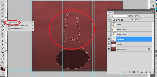
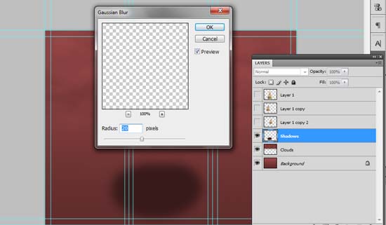
16.Then, press CTRL+D to deselect your selection. Go to Filter -> Blur -> Gaussian Blur. In the Gaussian blur options, use a 20 pixel value then press OK. This should make a blurry area for the bottom of our cake.
17.Once you enable the visibility of the cake back up, you should see the shadow effect appear. It is subtle but it adds more to its detail.

18.We then just apply the effect to the other images.

19.Next, we create another layer just above the background layer (CTRL+SHIFT+N). We name this layer “Floor”. Then, we use the rectangular marquee tool to select the bottom half area of the brochure design. We use the gradient tool with the black to white color gradient setting and inscribe the gradient unto the selection. The black part must appear at the middle as it seamlessly goes to white towards the bottom.
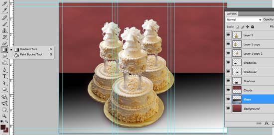
20.We then change the blend mode of the layer to “Overlay”. We also reduce the opacity to 30-35%. This gives us a kind of floor area on the bottom of the brochure.
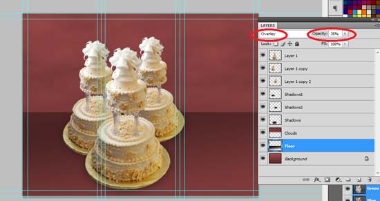
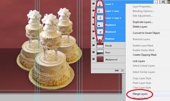
21.Great! Now if you are sure about the position of your images and the shadows, it is best to merge them all into one already so that you can adjust its position easily. In this example, we merge all the 3 cake “layers” as well as the shadows into one main layer. Do this easily by CTRL clicking on all the said layers. Right click on them and select the option “merge layers”.
22.Now, using the rectangle shape tool, we create a text box for the content of our brochure on the right most panel. We color this a dark theme color.
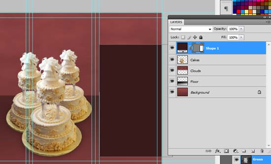
23.Then, we use the custom shape tool to add border ornaments to the top and bottom areas of the text box. Now, remember that this all depends on your content. Since we are “selling” classy cakes in this example we are using the ornaments. However the text box can have any kind of design addition you need. Take note that we have removed the guidelines for now to make you see the design better.

24.Then, using the same techniques as before we duplicate the ornament several times in a new layer. We use the ornaments in a chain to paint a border on the top and at the bottom of the brochure design. We change the blend mode to soft light and the opacity ot 60%.

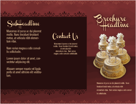
25.Then, we just type in our content using the text tool. In our example we used some nice script text for the headlines, and plain sans serif type fonts for the details. We of course used a lighter color for the text to make them stand out. Take note that we have brought the guidelines back up by pressing CTRL+H. As much as possible have all the text within the margins of the guidelines. Here, only the headline trespasses the guidelines just like the feature image. This is okay as we plan on creating the showcase type design.
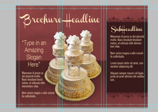
26.That finishes our inner panels design. Without the guidelines, it should look like the image below. Save it as your main template.
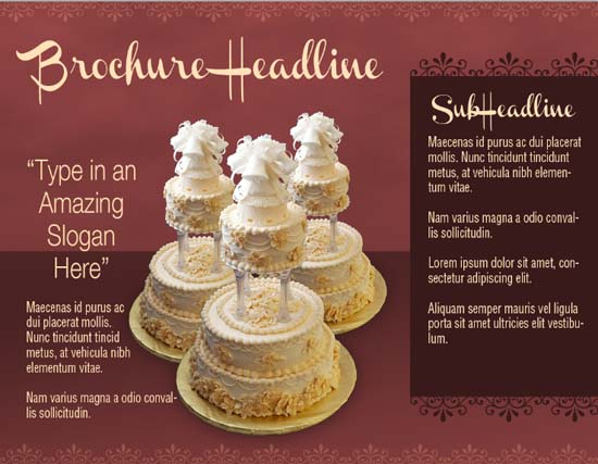
27.Then, we just re-arrange the elements to create our front design as well. It is just a matter of duplicating and repositioning some of our elements to create the outer part of our brochure. Keep in mind that the rightmost side is the brochure cover and the center is the back cover. So position your images and text content accordingly.

Congratulations! That finishes our showcase style brochure! Hopefully you have learned something from our design tutorial.



good tutorial, thanks