The written word has allowed us to document history, our thoughts and feelings or send messages through the ages. While we may have started with pictures to convey what we wanted to say, we’ve since moved on to typography that has adapted to reflect the times, the meaning and the format it’s used in.
Throwback to B.C times and you’ll learn of messages painted or etched into stone in caves and places where people lived and worked. It’s believed that formal writing actually originated around 3,500 B.C and was created by the Sumerians in Mesopotamia (now Iraq). They inscribed details of bills, inventories and records of births and marriages on clay tablets that stayed preserved for thousands of years before archaeologists dug them up.
The Egyptians developed this concept further, with hieroglyphics that told stories and recorded events with symbols and ideograms. The Phoenicians then went on to develop an alphabet which was adopted by the Greeks later. The Romans then adapted the written word to reflect their use of Latin – mainly used by the church or signage. The written word was shaped and changed over 100s of years by multiple societies.
Fast forward to the Middle Ages and writing had become a common form of communication. Texts are being transcribed into Old English and focus is put on presentation with neat lines of text and illustration.
The 1400s – Medieval ages – saw the introduction of moveable typefaces which significantly sped up writing but wasn’t particularly legible. In 1501, the italic typeface was born and was used to cram more words onto the page, as writing materials were costly.
Serif font was created in the 1700s and John Baskerville introduced those who could write to Transitional type. It was the preferred type for press work, as it was easy to read and set wide – so you’ll see lots of old advertisements from the time using it.
By this time, typography was relatively limited to advancements on the printing press. Writing by hand was still encouraged to be neat, with a preference for cursive or italic letters. The loops and swirls that we know best from when we try our hand at calligraphy were popular in letters and diary entries.
As time went on more and more fonts were introduced to the printing press from Copperplate Gothic and Goudy Old Style in the 1920s to Comic Sans in 1995 – one of the most hated fonts of our time. Computers became more commonplace, meaning the love for the handwritten word was lost for a little while, as we relied on Microsoft to create beautiful written texts for us.
However, this has all changed in recent years and the focus has shifted back to appreciate those who can handletter and create calligraphy style typography. Social media has seen a rise in accounts showing people how to create beautiful letters and signage has shifted back to a handwritten style. Typography has become personal again, no longer limited to machines and strict fonts.
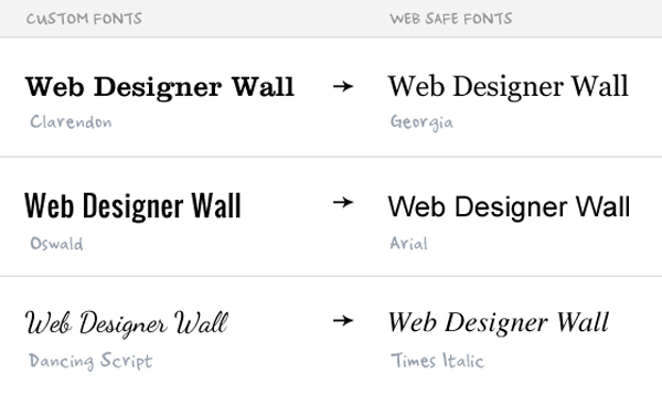
Typography has also evolved to become more than a way of simply writing things down. Fonts and styles of writing can convey different meanings. Times New Roman is reserved for those who want to stay serious and look professional while Calibri or Arial are for everyday use. For those who want something a little different they turn to Lobster or Pacifico.
However, as well as the written word we’ve also seen a shift back to symbols again for communication. Emojis are commonplace in society and let us convey our thoughts and feelings with an image instead of writing out anything at all. The trend for infographics and visual data has seen us prefer to look at imagery to tell us what we need to know instead of lengthy texts. They say a picture is worth a thousand words – so it’s easy to understand why we may prefer them.
As technology advances, typography will too. It will be interesting to see where we go next.