Content – that’s the king even today when it comes to the online world. So, no wonder that most of the businesses depend on high-quality content while establishing their online presence. And it does the trick as well. Most of the websites with excellent content perform well enough. But it’s not just the content that’s extremely important in making a website stand out. Web design plays an equally important role. And when you speak about web design, you just can’t ignore how the fonts help in making the content more effective.
Need an example?
Compare the fonts of the headings and the body of a content on any web page. Aren’t they different from one another – in size and style? In fact, many of the designers even use various fonts for the body and the headings and subheadings. That’s because they play different roles.
So, it is quite evident that typography does play an important role in web design. But it has been noticed that a lot of designers make a few common mistakes while dealing with this aspect of web design.
Here’s a quick look at some of the most common typography mistakes, which need to be avoided. Else they can have a negative impact on your web page.
Using Just the System Fonts
System fonts – surely you have those and they can be used. But why limit yourself only to the likes of Georgia, Arial and the like? The world of web design is ever transforming and it’s moving ahead in great strides every year. New fonts are also being introduced on a regular basis. Web fonts are also becoming extremely popular all over. So, there’s no reason why you should not use any of these to add more spice to your web page.
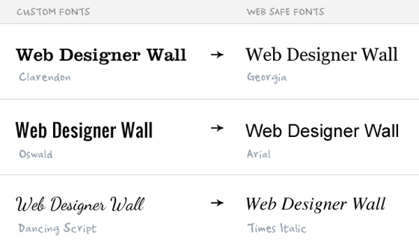
Not Assigning Any Fallback Font
You have used some of the best web fonts possible. And your site now appears awesome. So, is there anything else left that you must do when it comes to the typography design?
Ask yourself a simple question.
Have you considered any fallback font for the web fonts you have selected?
It might happen that the fonts that you have used as a part of the typography list of your site is not present in the repertoire of fonts of the viewer. In that case, the fallback fonts, which are web safe, can always come in handy.
So, what are these fallback fonts?
They are just what their name suggests. In case the viewer can’t see the fonts you have used, the fallback font functions as a reserve typeface. It has symbols for several Unicode characters. So, if the user doesn’t have the font in his system, they are shown in the fallback font. Hence, if you don’t assign those, you might lose out on many of the readers of your web page.
Here’s a quick look to Web Designer Wall example.
Not Using Enough Space
When it comes to typography, space is as important as the fonts. So, it is extremely important to use the right spacing while placing the content. In fact, the space can refer to:
Leading refers to the space between the lines of the web page. There is no specific formula for how much space you should use between the lines. In fact, it depends on a lot of things, including:
The font size needs to be selected properly. It shouldn’t be too small or too large.
Uniform spacing between the lines always appears good. The same holds true for tracking, which refers to the space between the words in a content. The kerning or the space between the alphabets in a word should be same throughout as well.
It is essential to use the space prudently. Because it’s an important task of the web designer to strike a balance between readability and aesthetics.
Not Following the Right Hierarchy
When it comes to typography, hierarchy has an extremely important part to play. In no web page, all the fonts should be of the same size. There is a simple guide to the hierarchy. The font size for the page title should be the largest. It should be followed by the headings in the body text. The sub-headings should be smaller than the heading, but larger than the body text, which should be the smallest in a web page.
If the hierarchy is not followed properly, it has a negative impact on the readability of the web page. The hierarchy of the fonts of a web page needs to be determined with the help of:
Different colors of fonts might also be used for the purpose.
Not Choosing the Right Contrast for Fonts
Typography doesn’t end with just the size, space and hierarchy of the fonts. You need to choose the color of the fonts prudently as well. And this really has an immense impact on the readability of the web page. Many of the web pages can’t be understood properly, as the fonts are not in sharp contrast against the background.
The different colors of the font can also be used to create hierarchy in the page. For example, a bright and captivating color can go perfectly with the headline, while the body text can have a dark shade. The hyperlinks in the text should also have a different color than the other parts of the page, so that they are easily visible. Moreover, you need to focus on the color of the text to ensure that your message has a perfect impact on your reader as well.
Conclusion
Why do you need to focus on the typography during web design? Because it’s an extremely important tool to connect with the readers of your web page. So, the more prudently you can use the fonts in the webpage, the better you are going to do that. And to achieve that, it is essential to get rid of these common typography mistakes that a lot of designers commit.


system fonts load faster stop making wait for 10 roboto fonts on mobile! grrrr