The foundation of any website is its layout. It is there to guide the site’s visitor and highlight the important things.
The entire site’s aesthetic depends on its layout, so it is very important to plan ahead on how to compose it. Finally, a good original layout improves the user’s experience, which goes a long way.
Simplicity and ease of access are amongst the main characteristics of a good layout. The site should grab the user’s interest while at the same time leave him free of any information overwhelming.
How to create great web page layouts
Creating an innovative and original web page layout is your best bet if you want to improve your visitor’s experience, but at the same time you must control your creativity and keep the page easy to use.
As always, it is best to put yourself in the user’s position and ask yourself: What would I like to see first? What’s the easiest way to communicate the message to the user?
These questions need to be asked before the very process of design even begins because they determine the very direction and the shape of your entire design.
Ideally, you should make your web page layout as original and as creative as possible. Improving the user’s experience and showcasing the website’s main goal is the main and only point of the cutting-edge design process, all that done in a compelling and attractive way.
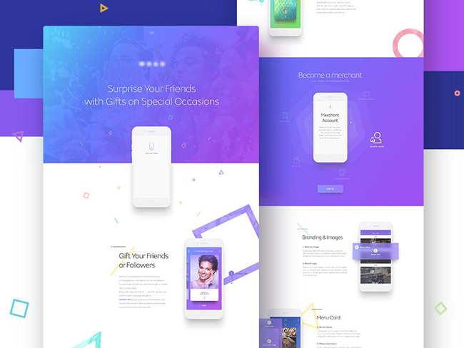
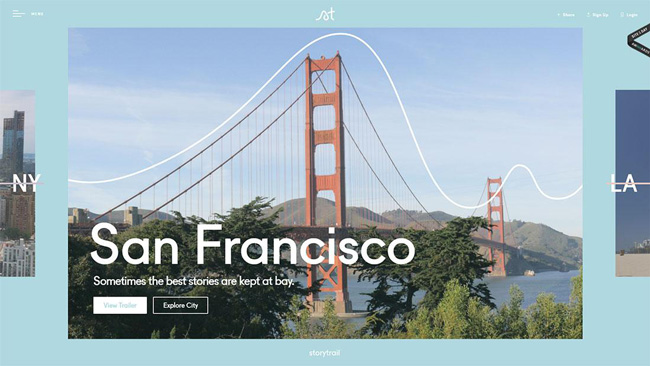 Storytrail Website
However, you must not let your creativity compromise the basic functionality of the page. When designing, you need to put yourself in the mind set of an average web page visitor.
Thinking about what an average site visitor appreciates and finds easy to use together with what they need to see first should always be your priority.
Make sure you design the header properly. This is very important because it’s the first thing the visitor sees.
Tips for differentiating your web page:
– You can set up an automatic slideshow that will run in the background and its navigation bar on the top of the page. When you scroll down the page, the navigation bar will shrink but remain encored to the top of the screen.
– You can set up a page loading 3D line animation that will fill the screen as the page loads. The fluidity and the positioning of the arrows will inspire the visitor to scroll towards the desired content. This type of layout is considered very comfortable as the arrows serve as indicators for the visitor.
– Designing the page with visual contents in the home page will add a friendly and fun tone to your site. You can set it up so that when the mouse cursor hovers above a certain image, a short text indication will appear informing the visitor of what clicking on that image will do and where it will lead him or her. This is a clean and well organized layout method of design.
Write down your brainstorming ideas first
It may seem as a simple advice, but many designers begin with Photoshop without giving any thought first on the direction they are going to take when solving a particular problem.
Remember, design is about solving problems with good and practical ideas, not with shadows and rendering. You must establish a good layout with a clear hierarchy, providing the content in a functional way, before you start making it look good.
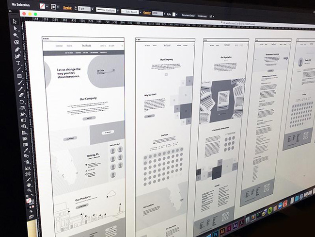
Sketching it first
When you think you have a good idea about a particular solution, try sketching it roughly first, positioning all the elements approximately in the way you think they should go.
This will give you a much better overview of the path you might take. Making a kind of a visual map before designing any content of any kind will help you create a better functioning layout.
It will also point out any potential mistakes and corrections you can make early on, before you do any work that might turn out to be wasted later on.
PSD grid
Do not do your Photoshop design without a grid. You may be told it is for beginners but there are no reasons to work without one ever, no matter your experience.
No matter your mastery of the PSD, your end result will never look as good without the grid as it will with one. It will help you make a better structure of any number of sections your layout will have.
And not just that, it will help guide you better through determining the screen size and creating responsive templates, that all need to be consistent with the predetermined spacing.
Font selection
In the web world, looks is what matters most. Thus choosing your font is very important, because having just the right boldness and size of text will determine the visual appeal your page has.
Other things are also very important, like symmetry and consistency – it is usually better to stick to one type of the font for the entire web site, or you may add another one if it is dictated by your layout, but it is best avoided.
Selecting the color scheme
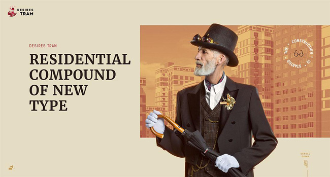
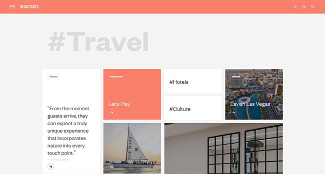 Departures-international Website
When you’re in the process of selecting the typefaces, you should already begin planning what colors you will use for the background, the UI, and the text. Do not overdo it. Limit your color selection to a few well-chosen colors.
Consistency is again important when coloring the website’s interface. Stick to few well picked colors when coloring the UI, but as far as the imagery goes, there are no limits or color restrictions, just make sure they don’t interfere with your component functionality.
Choosing appropriate images
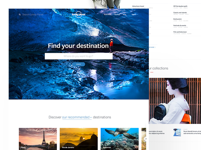 Source
Your images are supposed to be in tune with the main idea and describe it closer to the visitor.
If you are presenting a certain product, detailed images are welcomed because they will give the visitor the visual information and a good idea about the product, which will in turn produce trust.
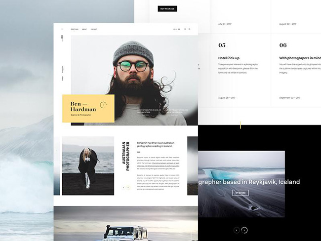
Dividing the layout
 Source
Every section of your site needs to tell its story. It needs to be there for a reason and contribute to the whole picture given to the user.
It needs to help guide the user with the use of highlighting and directing the attention to the important parts of your site’s story.
It is because of this that it is not advised to have too many different sections in your web page, making sure you don’t drift off of the main subject too much.
Rethink the established interactive patterns
Designers together shape the entire internet browsing experience, because our creations determine the steps and paths user’s need to take in order to get to certain information.
It is a good advice to follow the already working patterns, but patterns are sometimes there because nobody ever really spent too much effort thinking or rethinking a certain problem solution.
This is why it is a good advice to always rethink and question the established patterns with the goal of improving them.
To make a layout design good, it is a good idea to think about the simplest way to solve a certain problem first, and then add necessary components carefully. You will soon realize how actually hard it is to keep things simple and functional.
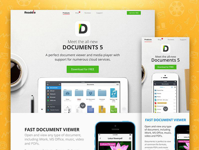
Design for various devices
 Source
Today, web pages are not only viewed on the computer screens, but also on various different popular devices.
It is a measurement of how good a designer you are if you can design a layout that is compatible and attractive on numerous different devices. Allowing easy access to a wider audience.
Paying special attention to the details
It is because of the overuse of this statement that its message is perhaps lost on people often, but the amount of attention you put in the details is visible in the final product and it will mirror your work quality.
Attention to details will not always mean more exhausting work, but perhaps finding a slightly different solution or surprising people with a small innovation will improve the overall impression significantly. It will also demonstrate the love you have for what you do and the inspiring approach you have to design.
Supporting the developers
The developers are generally innovative and can assist you in deciding on a concept direction for the layout, or on many other occasions.
You should always include them in your creation process from start to finish, not only for the parts of the job they are generally responsible for.
This will create a better team atmosphere and allow you to think more freely despite not thinking alone, because it will unburden you from certain things.
Hope for the best, prepare for the worst
Working as a designer, you will face many obstacles and problems, many of which are entirely not affected by you, such as maybe technical issues or creative constrains.
When designing a site, you must not limit its use to only your ideally planned scenario. You must leave room for mistakes, changes, and additional input.
For example, a site with little content may appear broken when a user views it through a small screen. It is thus necessary to determine the optimum amount of information that is needed to be displayed for any browsed size, concentrating on the most common scenarios naturally.
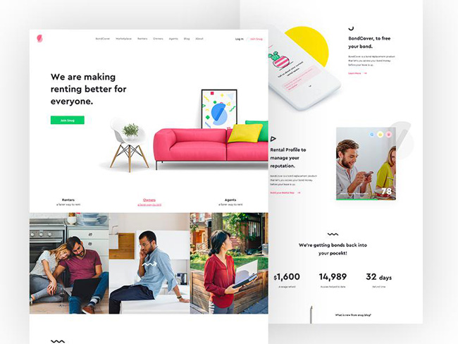
Constantly check and re-check the website
Source
Upon entering the development phase of the site building, you should pay special attention to the designed layout, because the development elements may disturb your planned layout in unpredictable ways.
In this informational age, websites are created with the purpose of reaching a wide audience and inspiring them to favor the particular organization or product.
It is because of this that modern age designers need to select the best images, absolutely appropriate content presentation, perfect themes and colors, and everything in order to make the page appear perfect.
Remember, there is only the first impression, no second.
Do not get too much attached to your ideas
You should love your ideas, but you must be wise when determining when to advocate and support one, and when to let it go. You must have a good connection to your client. As a designer, you must have a firm belief in what you do, but you must at the same time be open to new ideas and ready to quickly change course if necessary. There is always more than one way to a certain problem’s solution.
Conclusion
The layout is one of the crucial parts of any creative process, and it is the foundation to your website design. You must always consider the mindset of an average user and the different devices user’s might use to view your work. You need to include all these external factors in to your work.
Adopt and practice the advices above and they will hopefully be of tremendous help in your original and appealing web page design.

