Visual identity is one of the keys to a successful business. When a rebranding is done the right company can witness an increase in sales from new and existing customers. The constant brand presentation has seen an increase in revenue by an astonishing 33%. Introducing a custom business logo design is one of the most effective ways in spiking that brand awareness we’re constantly chasing.
Sure, doing this successfully is not an easy job, which is why it’s so amazing to see a rebrand done the right way. Let’s go over some great and some not so great examples of rebranding.
Coty
About the company:
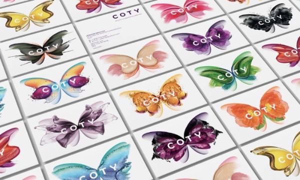
Cot has been in the game of the fragrance market for over a hundred years. To become the leader in the beauty field, the company had to redesign and restructure 20,000 employees under one, a brand new entity.
Why it worked:
The identity shifted to joyful, colorful to honor and liberate the diversity of beauty with a symbol of a butterfly.
Tropicana
About the company:
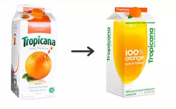
It started as a small company and developed into a global operator in the beverage business. They decided to start their re-branding process in the year of 2009.
Why it failed:
Consumers failed to identify the product on the shelves which led to a great loss in sales. It looked like a bad generic brand that was too far from the recognizable product faithful consumers regularly purchased.
Airbnb
About the company:
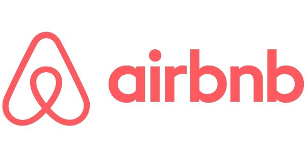
Airbnb was launched in 2008 as an online place for people to submit their owned or rented properties. Despite its global success, it started becoming pretty unclear what’s rentable and what’s not. Thus sparking a new branding initiative.
Why it worked:
The old logo was replaced with a polished new one; they switched the brand font and created a bespoke recognizable color called Rausch. The color was named after the street where the story of Airbnb started, transferring the emotion and passion of the brand.
Gap
About the company:
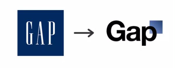
GAP is an international clothing retailer. In 2010 they changed their iconic logo that was so emotionally embedded in every customer. Some have speculated that the rebranding was so bad that it was a PR stunt.
Why it failed:
The change sparked outrage among most loyal customers. GAP switched back to the old logo after only 6 days.
GLPS
About the company:
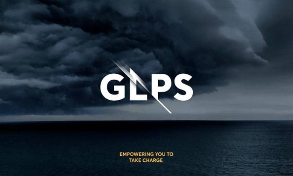
GLPS is a company that specializes in lighting protection for the wind and various construction industries. Their rebranding strategy targeted the idea of empowering their audience to take charge.
Why it worked:
Their logo managed to demonstrate it ideally by combining the lightning spark between clean and orderly type, which is a mark of their protection services.
Syfy

About the company:
SciFi is an American basic cable channel providing streaming services online.
Why it failed:
The biggest problem of the new logo was not about the visual identity or the color. Syfy the newly created name for the TV channel is also another word for a sexual disease in Poland. Talk about marketing for a long-lasting company.
To conclude
Implementing a highly successful rebranding strategy is not just designed for companies that are struggling to survive in a tough environment such as a modern market. Regardless of the reason, the companies will always benefit from branding if it’s fundamentally based on market research providing customers with something fresh and new.

