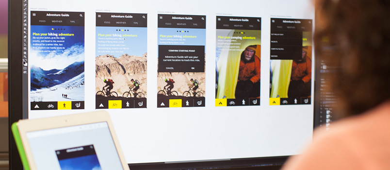
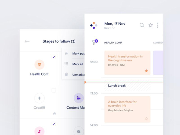
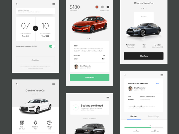
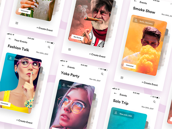
Great design is essential for the overall quality of an application, regardless of the misinformation provided by some people.
Design is even more important in the mobile aspect, where applications ought to be applied on smaller screens and through different operating systems. Despite the numerous obstacles, design proved to be an indispensable asset for web development.
How can developers improve their designs? How can they make sure that users will accept their work? We prepared a set of essential tips for the best mobile app design.
Don’t just ‘drop’ your app on the platform
One way or another, your app should be suitable for the platform where you are about to display it. It is a type of ‘honoring’ successful platforms and paying respect to the users who have chosen to be there.
Not even to mention that the app may be technically unsuitable for the targeted platform, which can cause complete failure for you and success for your competitors.
The standardization degree of corporate apps applied in multiple environments should be bigger than the one of consumer apps.
The purpose is to make sure the apps can be used on all devices, without technical efforts or learning periods.
The focus ought to switch from the device to the user experience (which is not the case with consumer apps). Once again, designers ought to follow basic interaction assumptions, such as menu access.
The ultimate goal is simplicity
Analyze your goals, think which is the most efficient way to simplify them and to make a really usable app.
Look for solutions in similar apps and test everything you’ve created on your own device.
Plan in advance – the future is almost equally important as the present
We cannot neglect the fact that ‘technology game’ is developing fast, and there are thousands of new players every day.
For instance, iPad was introduced only several years ago, but today’s iPads look nothing like the original one – they were modified in order to respond to contemporized needs.
It’s not easy, but try to design something that will last. You’ll obviously need to adapt it to the market in a year or two, but this option is still better than absolute redesign.
Keep constant track of improvements and developments and estimate whether you should really introduce a new app, or invest in a well-established website.
Think about context
Context is constantly discussed and we could perfectly understand if you think you’ve had enough of it.
Still, context is really important for satisfying customers’ needs. I mean… do you expect your users to do online banking on a bus, or inside their office?
Their majesty, final users
Proper user interface never loses focus from the final users. They are considered in every aspect of the procedure, and everything is done to satisfy their needs.
You may be an experienced designer who knows how to estimate his audience. You may even be skilled to make the perfect mobile app design. One mistake, however, happens repeatedly to many novice/experienced designers-they identify themselves as the final users.
Yes, you are human and you know what humans need. You could also take the role of a potential user, but you should never stand in the place of someone who is ‘meeting’ the app for the first time. You cannot know how he/she would feel.
Therefore, keep it simple. Create such interaction points that are welcoming, intuitive, and easy to use. Great interface design can also spare time and guidance expenditures before users start interacting with the application.
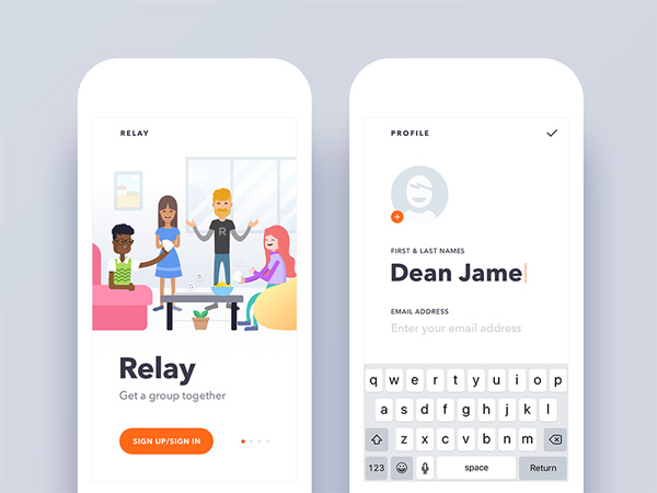
Take the mobile login screen, for example. Keep it as simple as possible for the user. Don’t put anything else on the screen other than the login form.
Mobile can make things easier
Among other advantages, mobile technology released creativity from all barriers.
Think about it – there are apps that perform auto-crop on image’s central focus using nothing but face recognition. It seems like the era of full-size sets and large applications clogging the devices’ limited storage/bandwidth is finally over.
The ‘less is more’ capability approach of mobile technology should not be your drawback. You can take advantage of it and design such capabilities which cannot be used with personal computers.
Let us give you few examples – you can snap signatures with the camera, or locate services and their suppliers. All things considered, these sensors can guide you towards proper efficiency, where users are not required to make additional efforts to use your app.
Mix work with pleasure
Coming up with an original app idea or preservation strategy for existent apps is everything but simple.
The least you can do to make it more interesting is to have fun while testing different versions. Be proud of your work and celebrate even the smallest of your achievements.
Details and complications will certainly annoy you at moments, but you have to stay focused on your final users.
The fun you experience while making the app is the same fun they’re going to have when they start using it. Replicate your feelings and nothing will go wrong.
Understand your users and familiarize with their behavior patterns
There is no better design approach than communication with users. Following trends or accepting web wide misconceptions can easily cause wrong decisions.
One of the biggest misconceptions, for instance, is that users are always in a hurry and they cannot make use of corporate apps on their phones. Well, they can.
In fact, users mostly turn to mobile apps when they have nothing to do (resting at home, traveling on the subway, etc) and they would welcome a big portion of the ‘not suitable for mobile usage’ app work.
A better theory to listen to is that mobile usage is increasing; and that soon desktop work will be completely compatible with the one performed on our phones. To be more precise, that’s not even a theory – it is the reality.
Talk to your users and ask them what they want. There is no better way to understand whether your app will be successful or not.
Interact with your users and reward their loyalty
Want to keep users on board? Keep your work consistent and give constant feedback. Paying a surprise for a well accomplished task is also not excluded. In fact, a free subscription can be very powerful in terms of user-developer affinity.
Don’t depart too far from the prescribed rules
As much as audience respects innovation, it still has a certain traditional perception of system operations.
They may clap hands and say ‘good work’ but they’re not going to stay if they have to reinvent basic operations. Therefore, it is important to stick to standardized elements and behavior.
This is especially important if you are planning to place your app on a specific platform. Want it or not, you have to adapt to the conditions and to adopt the practices of that platform. In such way, users will lose no time learning how to use the app and they will be satisfied.
For instance, the tactic is quite successful for Android and IOS. To be honest, a common approach doesn’t really simplify your work, as it can lead to identical results and such should be avoided. However, keep up the good work and stay patient and dedicated. If you are convinced of the quality of your app, design few versions and make it accessible from every platform.
Summing up, greatly designed apps depend on three main factors: responding to users’ needs; undisputable functionality; and user experience.

