There are two categories of websites that are constantly popular among users: food websites and pet websites. Most of web surfers can look through these web designs for hours and then come back to enjoy them again. Now we’d like to tell you some interesting facts about food and drink websites. There’s nothing extraordinary, but you should remember these things when creating a food website.
1.Photos & Photo Galleries
All catering website owners and web developers have to know that eye-catchy photos and images are half the battle. They attract attention and whet appetite. It is said that 40% – 50% of people living in the world are visuals. They see everything in pictures and have well-developed visual thinking skills. That’s why pictures are very important for all types of web designs, including food websites.
As usual, food and drink related websites use a lot of small and medium photos. Almost all web designs look good with realistic photos, so you’d better forget about drawn, pixelated and digital images. These pictures can fit you if you create a hand-drawn website.
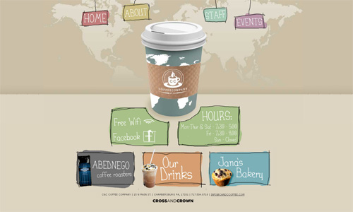
C & C Coffee
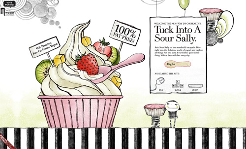
Sour Sally
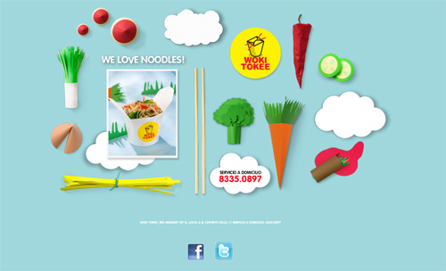
Woki Tokee
As you see these designs are quite specific. You should weight the pros and cons before choosing a design style of your website.
We’ve already mentioned that realistic photos suit food and drink websites. Rich colors make them look even more mouthwatering. More often you’ll see these photos within texts. They make good accents, so they are also good for menu toolbars illustrations. Here we have two websites with prominent images that are well chosen (from our point of view).
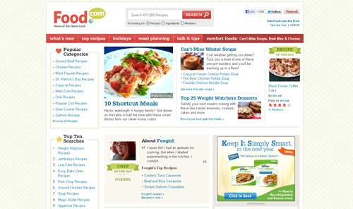
Food
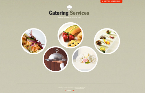
Catering Services
The most interesting thing in food-related websites is an image gallery. Frankly speaking, there are many different photo galleries that can be used to showcase tasty foods and juicy fruits pictures. You can use grid galleries, galleries with thumbnails, carousel galleries, image sliders, etc.
There are also several versions of the gallery placement:
- On the entire website. In this case the gallery is visible on all site pages. It’s rather convenient when you want to advertise products or services.
- Special gallery/portfolio pages (more likely home page). That’s the most frequently used option of a gallery placement. It helps save a clear website structure and make images notable for every site visitor. Such galleries are used in combination with background galleries.
- In website header. Web designers prefer to place a single photo at the top of a website. Such decoration elements look good and give site visitors a clear understanding of what the site is about.
- Full screen image slider backgrounds. These galleries are aimed at getting site visitors to spend more time on the website. If photos are chosen right each previous one organically leads to the next slide and makes visitors anticipate the forthcoming elements.
Selegiallo
Eating in Sydney
Burger King
Fishking
Buy for Less
Kraft
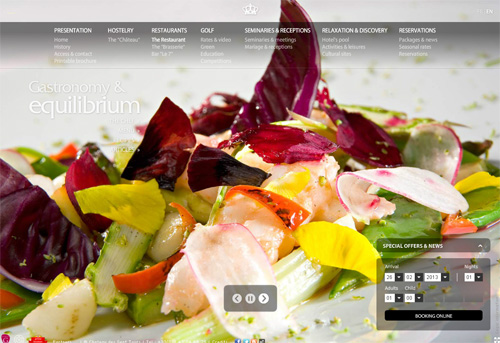
Gastronomy & Equilibrium
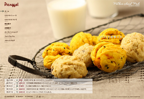
Picassol
2.Web Based Menus/Catalogs
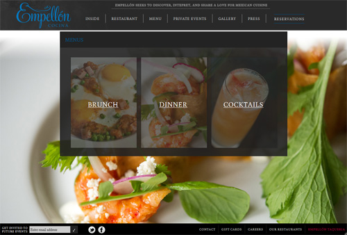
There are a lot of talks about online restaurant menus and catalogs of food and drinks. Everybody agrees that a menu is a must have thing for every catering website. But it can be displayed as a separate website page or as a PDF file. When you use PDF files you make visitors download them to get to know what’s cooking at your place. A lot of people won’t do it because it takes time and because it’s a slightly separate experience – it’s beyond website. They’re more inclined to leave your site and to find another one with a menu that’s available online.
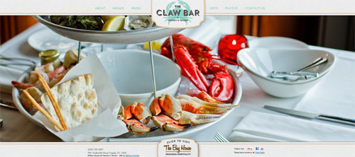
The Claw Bar
Empellon
3.Contact information
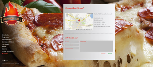
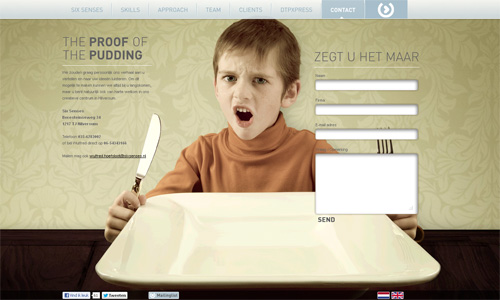
Make contacting you easy. Place your online and offline contact information in a plain view. It’s also a good idea to add a map with your cafe (restaurant, bar, office, pizza place, store, etc.) location. For example, Google Maps service allows you to quickly and easily integrate an interactive map into your design.
And don’t forget about working hours. This info will be appreciated by all your site visitors.
Nortorf Grill
Six Senses
4.Mobile-friendly Website
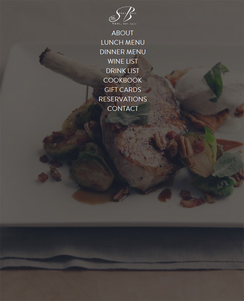
You can neglect this feature if you create a website for food manufacturers that wholesale products. But if you work for cafes, restaurants and companies that sell food to end-users you should think about a mobile version of the website. You can choose a responsive web design or a separate mobile website. It’s up to you.
Remember that very often people use mobile devices to find the nearest fast food restaurant, pizza place or a cafe. They need a quick guide and you can help them.
Sweet Basilvail
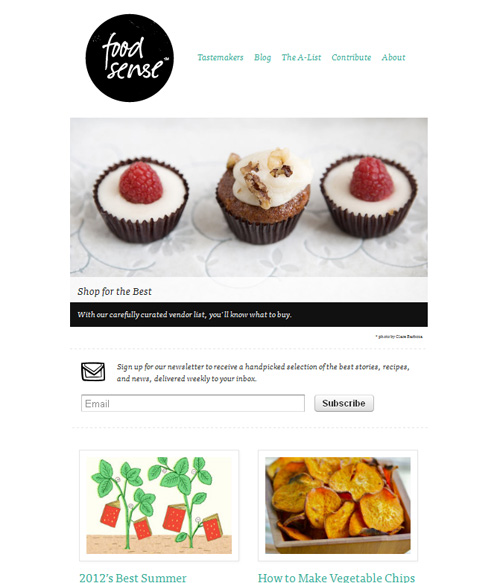
Food Sense
That’s all we wanted to tell you about food and drink websites. You can agree or disagree with this viewpoint. Anyway, let us know your thoughts by writing comments below.





In my experience food-based companies prefer to work with design studios that have experience in designing food-based websites. Having had trouble breaking through this barrier, I think this article poses some interesting points and may serve as a helpful tool for us going forward. Thanks for sharing!