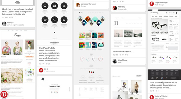
As a web designer we often take inspiration from many things around us. And every day there are several technologies and tools popping up to help us collect and share the inspiration. One such tool is Pinterest, which has climbed the social media ladder to become one of the most popular social media applications in today’s world. Do you know that Pinterest crack 10 million monthly unique visitors faster than any other site? No wonder, it is interesting to see the impact of Pinterest on web design community.

Pinterest – The designing inspiration
Pinterest is visually oriented and can be used effectively to drive more traffic and gain more exposure. You can set your own boards for the designs you will be pinning, and also edit the boards and pins at any time. And once you’ve an account, you can follow other users or other boards. Moreover you can repin your items that have been pinned by other users, leave comment and send messages to those users who are particularly following you.
With 70 million users, it is also worth mentioning that the average time spent on Pinterest per visit is 14.2 minutes. And what’s more interesting to note is that Pinterest users are always ready to spend more money than users of other social sites. No wonder, it has become a major source of design inspiration. If you’re not sure of how to make it work for you, keep reading…
Pinterest and Your role
Plan strategy for your board
Once you’ve created your account and complete your profile, it’s time to plan your board. Create boards for different designs, for instance, make a board to pin logo designs and another one for web designs from your portfolio. You can create as many boards as you want, however, it is important to think about the types of items you plan to pin and how to organize them. Creating group boards and inviting other users to join the boards is a good idea. But make sure that there aren’t too many boards as that could be confusing. A well-organized board generate more interests and create less clutter in the stream.
Image specification
Once you start pinning, it’s important to think about how your images will look. The perfect image specification is 600 pixels wide as that is the maximum width at which pins are viewed. If you want to make it small, opt for 80 pixel wide as this is the minimum width that Pinterest will recognize. Avoid pins that are too wide and deep as they look awkward to look at and read. The Pinterest thumbnail images should be ideally 192 pixels wide and thumbnail for individual board is typically 222 by 207 pixel. Remember vertical images and graphics work best, and the more your images stand out, the more likely they’re to be re-pinned. This indicates more exposure for your pins, and more opportunities to gain new followers.
Clean blocks of images
 Pinterest feature the grid style display of images. As a web designer, it is best to follow the minimalist design style to display your design, be it logo design or landing page in orientation. All the images are placed in blocks of same size, and clean lines make everything much easier to view. Minimalist design technique makes images simpler to see and digest.
Blend text and image
To make your design stand out, use text in the graphics using the best font. Text description for each pin should be 500 characters. It is better to opt for shorter description, as it makes easier for people to read them. Using text make it easy for people who are scanning your design to quickly know more about your pin. This creates opportunities for your images to gain more exposure.
Make use of color palettes
Do not hesitate to play with colors on your web design. Photos are always assembled by category on Pinterest, and a simple search can yield an inspirational color wheel of images. Choose images and shades that complement each other. It will automatically get the viewer’s attention. Images with a cohesive theme and eye-catching colors are always soothing to the eye.
Spread your pins
Pins are always in chronological order. The most recent pins are always on the top. And this is the reason you must spread your pins amongst the streams of people who are following you. If you post too many pins all together, it may make your followers unfollow you. Moreover, spacing out your pins offers better visibility. Make sure that your followers are not missing out on anything, as this can lead to more re-pins, exposure and traffic. You may use the following strategy to space out your pins
– Visit Pinterest at different times throughout the day
– Try to manually pin items
– Use different apps and tools to schedule your pins.
Easy navigation

Easy navigation and being social media friendly plays a big role in making a website user-friendly. ‘Pin it’ button, ‘share it button’ and relevant links give people access to share and post your design or content on their preferred social media application. In addition, if you have comment section, it will foster more interaction among site visitors.
Pinterest has given a great transformation to the whole conception of website designing. It is not just for foodies and shoppers, joining the ranks of Pinterest users can help you promote your work.


