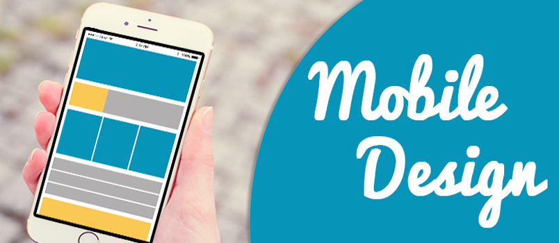
With the rising influence of mobile technology has on the online world of web design and e-commerce, it’s a smart idea to focus on a great mobile design for your site. Your site’s desktop design may look and function the way you want it to on a laptop or desktop computer, but in a mobile interface, it may flounder. To increase your site’s effectiveness, it’s vital to create a new version of your home page optimized for mobile devices. Here are five ways you can make your website’s mobile design look and work great.
1. Keep it Simple
The key to a great mobile design and top user-friendliness is a simple and clean appearance. With reduced battery life, smaller screens, and fewer power options, a mobile site with less will do more for your site’s visitors. Additionally, a cleaner design may look better across the different types of mobile platforms that users may be operating, like Android, Apple, and more.
2. Mirror Your Website’s Content
Your mobile design will be a better investment if it also has content that mirrors your regular website. The idea is to serve different types of users who may be entering your site solely through a mobile device. With more people spending time on mobile devices than desktop or laptop computers, your visitor experience must be similar across devices. This way, your mobile users won’t lose website features or functionality.
3. Focus on the User Experience
With your ideas about your mobile site, the main focus should be on your user’s experience. That means you must optimize the navigation to be simple and easy to access from a smaller screen. Loading time shouldn’t be too long, otherwise, your visitors could get frustrated and go to your competitor’s website. Limit your use of text or other types of input in your mobile design to give potential visitors a smoother experience.
4. Select a Mobile-Friendly Font
With your mobile design, the font matters more than you realize. Many expert web designers recommend a sans serif font for better readability. You must also consider the size of your font and how it will display on various types of screens. A font that is too small can be impossible to read for most users and could limit your potential visitor growth. Having a website builder on your side, like web.com, can help you make the best font decisions.
5. Test Your Site Design
Most of all, it makes sense to spend a great deal of time on testing your design out and seeing how it works in real-time. You can get professional testing services, and you can also go through the site yourself using a variety of mobile and desktop devices. Try out your site using a standard sized tablet and a smaller smartphone to see if your site’s important points are visible and easy to navigate.
Getting your website’s mobile version set up is a great way to open up the accessibility of your online presence. Make sure you focus on following a few design rules to give your mobile site the best potential for success.


