Building a website for your law firm is no easy task. Much like with law firm software, there are so many different options and ways to present your services to the public. If you struggle with presentation and marketing, all you have to do is look for inspiration online! Don’t worry, it’s not stealing if you can put your own spin on it.
Here are some law firm websites that deserve your attention.
Small Law

Small Law offers legal services to businesses in the Vancouver area. The word “small” can be compared to another similar word, which is “minimalism”. Instead of giving way to fluff and fillers in the form of fancy multimedia, multiple pages and subpages, and different fonts, the website gives clients everything they need to know, straight-forward.
A lack of imagery can make the website look sad and uninteresting, but it works really well in the case of Small Law. If you’re a fan of minimalism yourself, you know that less is more!
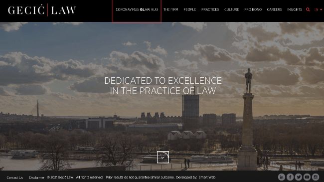
Gecic Law

Gecic Law is based in Belgrade, Serbia. Though you might have your doubts about such a faraway land, they will disappear once you click on the website. It is very complex. You will be greeted with a beautiful, scenic video right on the home page. Scroll down to find out what the firm is all about.
The firm’s use of multimedia is classy and captivating. Even though it is a lot more graphics-heavy than Small Law, it manages to get the point across just as well. On Gecic Law’s website, everything is always in motion, just like in the legal world.
YLaw Group

YLaw Group takes a different approach to graphic design and multimedia. The firm chose to use humor as a way to attract people to look into their services. On the website, you will be greeted with one of many amusing photos supported by a witty caption. For example, there is a photo of a man with his head in a cloud, accompanied by the caption, “Divorce may cloud your judgement… Not ours.” Though not every person going through a divorce will be able to laugh at that, it’s rather disarming.
The website also introduces clients to every YLaw lawyer and gives a full overview of all the services the firm offers. On top of that, there is a blog with useful legal tips and tricks, and other interesting tidbits of information.
TSMP

TSMP is a law firm based in Singapore. The firm’s website attracts attention and appeals to the eye because of its use of imagery. As soon as you enter the website, you will immediately see a beautiful woman, who, you’ll soon find out, is a partner in the firm. As you scroll further, you come across more people that work in TSMP.
The pictures and videos on the website create a certain family atmosphere. Everyone looks so friendly and kind, yet successful and polished. Learning about the people you will be working with makes you feel more connected to them right away. Not to mention, the firm’s use of fonts and colors creates a classy and luxurious feel.
Arnold & Itkin

The firm Arnold & Itkin focuses on maritime law, which is a fairly specific subject. Though very few readers will be able to relate to this field of law, the website can still teach you a few things about website design. The main thing is, if you have a theme, take advantage of it! Arnold & Itkin took the sea theme and ran with it.
The website stands out in a sea of competitors (pun intended) and lets the clients know exactly what to expect. When everything is blue, you know you’re about to go for a swim.
Keep it simple!
If you’re just starting out, these websites will point you in the right direction. Think of it in terms of law firm software; you would go for something simple, right? To make your job easier, understand exactly what image you’re trying to convey, and don’t overcomplicate things!


