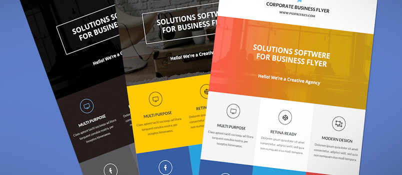
Designing the perfect flyer can be extremely daunting, especially if you’ve never done it before. However, though the process can be nerve-wracking, the result is always worth it.
The design of any flyer demands a solid content plan alongside the brain and hands of the finest designer, who, in this case, is you. This combination results in a product that your clients will love and all its users will find engaging. We’re giving you the top seven tips from designers worldwide to help with your next flyer design, all in this article.
1. Develop a flyer design strategy
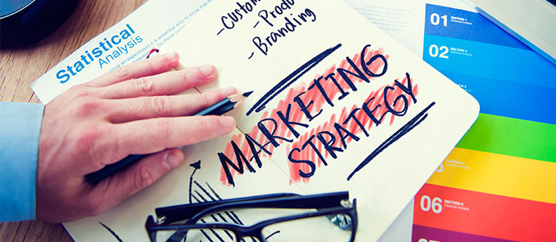
There’s a lot of thinking work one must do as a designer before putting pen to paper or mouse to monitor. The thinking work involves creating and developing a design strategy for the flyer you’ll be working on. In creating this strategy, these are some questions you should consider:
– What’s the budget for the project?
– What does the client want to convey to users and customers with this flyer?
– Where are the flyers going to be distributed?
– Lastly, how’s the flyer printing process going to be done? (don’t forget that you can use online services like Bizay’s flyer printing tool!).
Answering these questions provides you with enough technical information with which you can start the design process. You get to know the best themes to consider and the preferred flyer sizes and shapes to implement.
2. Make use of headings and contrast
Two things that catch the eye of onlookers regarding flyers and other forms of advertisement are a catchy title or headline and the images used. The headline is usually the first thing to pop into vision, thus, making it something unforgettable. It must be attractive enough to pique your users’ interest and encourage them to read through the entire flyer.
Concerning contrast, it’s been established that high contrast images are great at catching attention since they’re easier to glance at. That being said, your flyer should use contrast on images to pull users towards its content.
3. Keywords and CTA’s are great tools!
Like SEO, keywords can be used in physical design to sell your information faster and catch potential users’ attention. Certain keywords and phrases can help sell your flyer’s information. Once you identify and use these keywords, ensure that they stand out by making them brighter, bigger, or bolder than the other words.
After highlighting these words, you’ll need to include a call-to-action, also known as a CTA. CTA’s are the next steps for people interested in what your flyer offers. It can be in a discount code, a contact number, or even a location—anything to guide your user on what to do next.
4. Pay attention to scale
To find the flyer’s best scale and ideal viewing distance, you need to know where the flyer will be placed and the format it will be printed in. Next, you’ll need to print out a test version in that size and format to know whether or not the viewing distance and the scale is ideal. During your test session, ensure that every element in the design is appropriately scaled for the chosen format.
5. Be careful with Fonts and colours
Fonts and colours are chosen after considering the client’s brand colours, their intended content on the flyer, and the event’s theme. Choosing the font and colour with this consideration helps establish a connection between the promotion, occasion, or event and the flyer content. It conveys to the user that you pay attention to detail and are determined to deliver nothing short of quality.
6. Use the top-down approach
Most designs use the top-down approach because flyers are usually read from top to bottom. Reflecting that follows the natural order of human behaviour guarantees that people will interact with your flyer.
With the top-down layout, all your important information is located at the top of the flyer, trickling down to the bottom of the page with the least important information.
7. Use a printer template
Use a printer’s templates while designing your flyer to stay within the bleed and trim lines. These templates help with technicalities you might oversee during the design process and will help save you a lot of time and money and even heartaches during the final print. With printer templates, you don’t stand the risk of cropped images, missing letters, and weird colour representations.


