The battle for fashion statement no more just encompasses clothing, jewelry or stylized watches. Most competed area of making a fashion statement is on the web itself. Yes, in look, feel and smart user interfaces or in facilitating more user preferences for accessing the web, innovation and creativity are the driving force now for an array of web design trends. The web in the current avatar is increasingly becoming a place to find your creative spurt as a designer and the whole web is changing so fast in look and countenance that no longer you get hold of anything as irreplaceable. Result is obviously not just so called visual aspects but a growing focus on user behavior and their preference. From big-sized buttons to enhanced support for better display to responsiveness of websites in different devices – all these new design elements and many more are more concerned on making user experience better than just adding glam to the site. Here below we introduce 10 hottest web design trends this year.
Large Navigation Menu
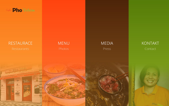
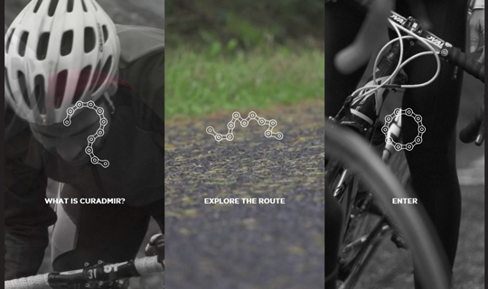
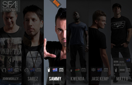
The latest among the hot trends of website design is to use large and bold navigation menu buttons. Bigger and prominent menu makes navigation easier and that is only the utilitarian point of view in regard to this new aspect. It also gives the site a sharp, bold and prominent look. While directing users on other pages of the site is a priority for enhancing organic traffic, this makes a provocative element for the users to get directed to.
Photuanlan
Curadmir
SIFA Events
Flat design and colors
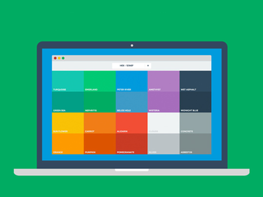
Life inspired designs incorporating shadows and life like perspective of things on the screen is already looking mundane and common as they have been the order for quite some time. Now the old day flat design optimized with smarter space division and color schemes is again becoming hot trend for the designers. Many tech giants are even preferring flat colors, clean and smarter utilization of space instead of lifelike elements like drop shadow and detail objective perspective. Apple’s iOS 7, Instagram, Facebook, Lorenzo Verzini, Ford Mustang and many others opted for the flat design and many others are still on the verge of picking up.
Excellent bold typography and fonts
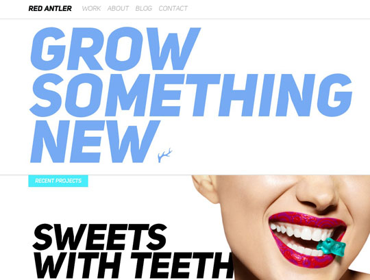
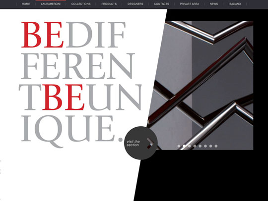
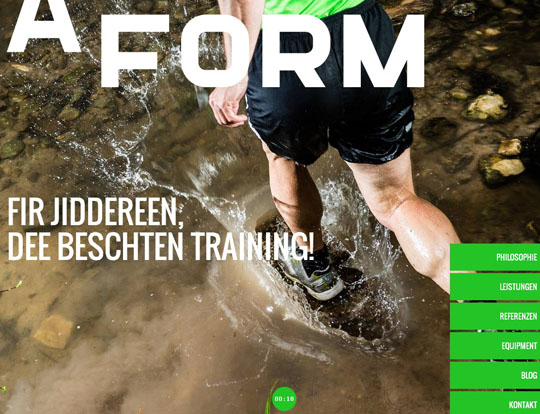
Using web fonts became easier now with most of these publishers are offering also sync services for local desktop. This gave rise to huge focus on utilizing typography or diverse font types in web design. The Bootstrap framework by Twitter also helped in typographical designs in more ways than one as it offers an array of stylish layout models with large type at the front. Use of grid alignments with prominent typographical fonts in different sizes and colors make a trendy design that many sites prefer. Besides ornamental treatments in font and typography this design is characteristically bereft of images or pictorial effect.
Redantler
Laura Meroni
Aform
Responsiveness is the design law
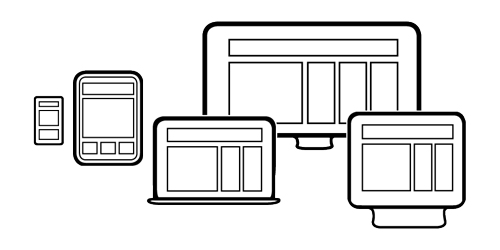
Responsiveness is no longer is a new design aspect or trend to consider. But suddenly with the number of mobile users fast overtaking the number of desktop users, it has become a necessity now. Responsiveness is the design aspect that makes a website appears perfectly across different devices. As mobile users are steadily becoming the most rigorous group of web users a website being responsive is a necessity for users. Navigation, page layout, content display and all aspects crucial to different screen sizes of different devices are crucial elements to judge the quality of responsive design. In the recent time as browsers are increasingly adopting to the new CSS3 modules, for web designers this is becoming easier than before. This is one trend that seems to stand for years in future.
Smooth and moving Parallax scrolling
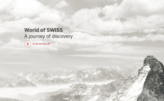
It was a technique that was served sumptuously by the video games of 80’s but it now returned on the web as a great design effect. Just as you look through the window of your moving vehicle here on your screen also closer objects disappear fast than the farther ones and a new page arrives. It feels incredibly smarter and offers a change from the monotony of scrolling down. From Sony to White House website to Costa Coffee, an increasing number of top shots prefer the smartness of parallax scrolling.
World Of SWISS
Use of Infographics
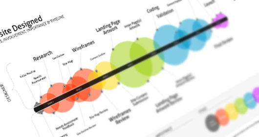
Infographics became the hot new preference for the data savvy business websites or others who have a lot of data to invite attention of their viewers. It is the smartest design route to showcase huge amount of data in a small place without costing a premium. For instance a website with nutrition as their focus can display large quantity of data on various food objects in a single page itself. Smart infographics are preferred by the user because they deliver the pure data without the clamor of so called expressive terms and instead of reading a 5 page article one can get his required data and insights from one such infographic presentation only.
Scrolling infinitely
Infinite scrolling solved the problem of website navigation in a simple and effective way than ever before. All your website data is on the single page and only thing the user needs to access different portions of the site is to scroll down. You scroll on and on infinitely without knowing that the site is a single page one and understandably to the benefit of users. When you want to tell a story or offer a presentation it offers a better approach in comparison to so called multi-page approach. Many websites use infinite scrolling and some of them to give a creative twist to their website add parallax scrolling effect partially with it.
Showcase of One Page Websites With Animations(while scrolling down)
Colors Of Motion
Forbi
Less text input
Offering less and less text on the opening page has now almost become a norm and most sites are eagerly following the trend. Either offering a few bold lines with a flat backdrop image or grid of colors behind or a full screen image with a small text in the corner or a few words on a flat colored screen with typographic design output – in every possible way today’s design are focused on telling more with less text.
Single page sites
What type of sites do you think has a better chance of being read throughout, single page sites or traditional multi page ones? The answer almost always goes in favor of single page sites. Yes, most readers prefer to browse through the first page of a website and then lose interest in navigating to other pages. That is where single page websites have a better chance of being read than sites with multiple pages. Visitors often scroll on until they finish browsing the first page and so offering all contents in a single page with infinite scrolling effect can be smarter.
Use of animated SVG
In the past few years web has started being increasingly taken over by numerous icons replacing texts. From simple navigation buttons to expressive stylish typography in front page, various icons are replacing text as smarter alternative to enhance design aspects. The trend is showing huge promise of growth. In this context ‘animated SVG’ is the next big element that can make web take the next turn. Moreover popularity of flat design and simple block colors in design will further create ideal environment for SVG.
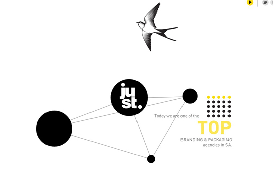
Just Design
Over the years web design turned more to a minimalist approach and in the last one year this has exploded into every arena of web presence. In this changing spectrum of web design mobile web played the most important role and in the near future evolving mobile devices will play a bigger role to influence these design elements further.





Flat Responsive designs and parallax scrolling is really the in thing. Parallax websites grab the attention of viewers at first glance and create ever lasting first impression.