A navigation bar is a must-have for any website. It enables users to go to different pages easily and quickly. Most visitors start looking for a navigation bar as soon as they enter the website. It is impossible to achieve a seamless website performance without paying attention to navigation bar design. In this article, we will have a closer look at the benefits and importance of a good nav bar for a website design.
What is a Navigation Bar?
Simply put, a navigation bar contains links to the other pages on a website so that the users and search engine robots can quickly go to any other website page. It is a traditional method of navigation familiar to most users. It can be horizontal, vertical, fixed, or dynamic. A navigation bar design is one of the crucial points of website usability.
According to the usability report by Komarketing, nearly 50% of users search for a nav bar on a new website. What is more, 37% of respondents stated that poor experience with the navigation bar was so annoying that they left the website right away. If you don’t want to push users from your website, you should pay close attention to nav bar design.
Why is Good Navigation Bar Design Important?
As an easily locatable element, a navigation bar helps readers find topics and subtopics they are interested in. Before we move on to the tips and examples of a good navigation bar design, let’s talk about its importance and advantages.
– Draws the visitors to the website
Navigation bars are familiar to users, and they are one of the first elements users look for while visiting a website. Web designers realize that the nav bar affects how users read web pages. As a rule, they are placed in the upper left corner or at the top of the website.
To make your navigation bar more effective, use something more outstanding than a traditional burger menu. Play with fonts, colors, and forms to draw more attention to the site.
– Guides the visitors on the website
The main aim and importance of navigation bar design are to guide the users through different website pages. This element shouldn’t overwhelm users with options. It should be clear and transparent, containing only the essential elements of the website.
– Provides information about the website
Users visit websites only if they have a reason or demand. A website navigation bar design should include enough white space, appealing text, and, if possible, pictures to inform the visitors about the website. Images are more illustrative and effective than text. If your navigation bar allows it, place the pictures in addition to or instead of text.
– Convinces the users to stay on the website
To design a navigation bar, web designers should consider different aspects. One of the critical factors is the number and importance of the website pages. Use the “three clicks” rule so that the visitors can easily visit any page on your website in no more than three clicks. If the user selects the wrong first page, they can abandon the website right away.
Plan the navigation bar according to the hierarchy of the pages. Arrange the pages logically and intuitively. Think about all the options for users to ensure that the menu helps them get to the necessary page.
– Improves the rating and the search optimization of the website
A navigation bar design is important for website traffic and SEO. The links on the home page and suitable headings are critical elements that ensure that the website is crawlable and accessible. Headings and links with keywords are more beneficial than one-word headings as they improve the search engine ranking.
For search engine robots, a nav bar is like a backbone. If it is too complex, they simply wouldn’t crawl and index the other pages. A clear structure is a must-have if you plan to make the most out of the organic traffic on search engines.
How to Improve the Design of Your Website’s Navigation Menu?
If you want to learn more about how to design a navigation bar that looks and works well, keep on reading.
– Place the navigation bar on the top
Most users expect to see a navigation bar on the top of the website. The visitors will look for it in the upper left corner or below the header of your website. Make sure you place the navigation menu in a predictable place. Pay attention to the location of the nav bar on other websites, especially the websites of your competitors.
– Add only general categories
This is essential for websites that cover multiple categories. Have a more general look at the website or mobile app and define the most popular categories on your website. Add the different subcategories that are more specified than those placed in the main navigation bar.
If there are too many options on your menu, the site visitors may become confused. Keep in mind that seven elements are more than enough for short-term memory. Define the most important information the users will look for on your website and place it as the main menu sections. This will help your navigation bar and website, in general, look more structured and organized.
– Place your location
Help your users know where they are on your website. Pay attention to the animation of your navigation bar. A breadcrumbs menu is essential to keep the users engaged and informed. It helps visitors go back to a more general page and continue interacting with a website.
– Make the navigation interactive
A flat and boring navigation bar won’t add value to your website. Think about making the navigation more interactive. Create sections that change colors when you hover over them or add drop-down menus that appear without clicking on them.
– Test the mobile responsiveness
Pay attention to how your nav bar looks on mobile devices. You may need to reorganize your menu on smaller mobile and tablet screens and add only a few critical options. The other pages should be accessible if the user clicks on the “More” button. Think about how to organize drop-down menus on mobile devices and tablets. Mobile responsiveness is critical if your target audience is expected to access your website via mobile devices. Placing a familiar hamburger menu will have a crucial role in the experience of mobile device users.
– Add the search function
If needed, a search function is very helpful on a website. It is essential for news websites, online shops, and media websites. This feature helps users save time on finding the necessary content. However, it may be redundant, so consider placing a search function only if the need is critical.
– The contrast between the text and the background
It plays a crucial role, especially if your website has dark and light modes. Pay close attention to the color schemes you use. Make sure all the text is readable, and the fonts are suitable to the colors used. All the navigation bar elements should be visible.
Top 5 Navigation Bar Design Ideas
Here are examples of the best website navigation design to consider while developing and designing your own site.
Villes & Paysages

The menu uses the same materials and shapes as all the other website elements.
Thieb
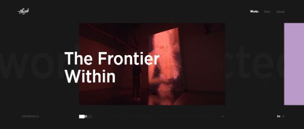
This navigation is a good example of interactiveness and conciseness — nothing distracting, only essentials.
Martin Building Co

Only the most important pages are included in this nav bar design. The colors are well-chosen, and the website looks organized.
Anne Klein

This is what a great e-Commerce website navigation should look like—the drop-down menus with different sections, images, and an intuitive structure.
UPQODE

This menu is clear, engaging, and well-thought. The CTA is in the right place. Pay attention to the excellent animation used.
Conclusion
A good website is not only about the code and architecture; it is about interactions with your visitors. One of the most important aspects of UI design is the navigation bar. The tips above will help you make the most out of the user experience.

