Most of the web designers gives due consideration to the aesthetics of the web design. There is no denying that visual appeal is important and should be given the highest priority, but often designers get soaked up with creating pixel-perfect designs to a extent that eventually leads to designing pitfalls. This post will take you through the top 6 mistakes that web designers generally make.

Website Navigation Flow
Navigation is one of the most valuable components for every website. Some website layouts, irrespective of how alluring they may seem, may not deem perfect to your visitors if they involve complexities. Put simply, most of the page visitors (though not all) look for easy-to-use and straightforward navigation bars, as it enables them to move from one page to the other in the site with ease. However, getting flashy navigation instead of concentrating on building simple to use navigation bars can leave visitors confusing and bewildered.
Also Read
Bad Typography
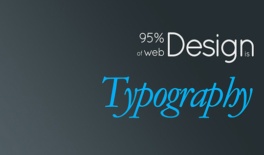
 Typography is another important web design component, but sadly in today’s world wherein more attention is being paid to cliches, typography is often neglected as an integral part of the web design. You can’t just settle down for any text for your site. Using tacky and poor readable fonts can encourage your web page visitors to abandon your site within seconds of their visit. Remember, 95% of the web design consist of typography and most of the matter presented on the design comprises of letters and words.
Also Read
Not Integrating the Right Social Buttons
 Adding social media buttons to a site is fairly simple. These buttons are valuable asset of your website that let you connect to a wider audience present on the other platforms. However, it’s imperative to integrate the right social media buttons to the site. For instance, let’s say you’re running an online fashion site, then adding a Linkedin button won’t connect you to the customers who would certainly like to buy products from your e-shop. The basic objective behind adding these buttons is to expand your reach to people who’ll most likely share a word about your offerings to their friends and acquaintances. Bear in mind, integrating relevant social buttons is a necessity than just a fad.
Slow Page Load Time
No doubt, adding visuals than text encourage visitors to stay a little longer on the site. But over-boarding your site with dozens of videos, big images, flash features and so on generally causes the page to load slowly. But your visitors may not like to wait for the page to load. Therefore, it’s necessary that you should curtail the use of complicated and plenty of visual stuff. Rather you should try to add simple and intuitive visual elements.
Browser Incompatibility
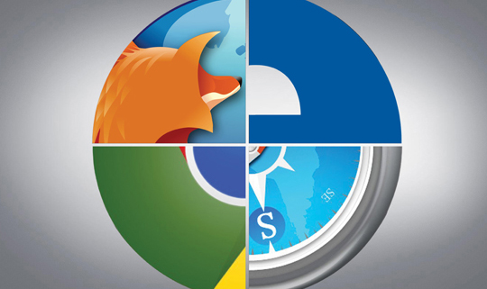
 Web browsers have dissever dependencies. Moreover, with the addition of new features certainly your web design will start looking antiquated. So, always begin with a basic design layout that will work well on all the browsers, and that can scale to adopt newer features of the browsers. This will make the design more accessible to users, and thereby will drive in more traffic to the site.
Also Read
Not Testing the Contact Form
I want to end the post with the most common yet important concern – that can put all your efforts in creating a beautifully-crafted design to trash. The sole purpose behind website developing is to get connected to your page visitors. For this purpose, it’s essential to have a not just a well-designed contact form but one that functions properly. No matter, how great contact form you might have come up, if it doesn’t work your business will surely doom to failure. Not testing the contact form can act as a stumbling block in your route to becoming a successful web designer.
Conclusion
You might have come up with a really enticing and captivating web design. But merely paying focus on the designing part can make you commit designing mistakes. No need to worry! Avoiding the above discussed mistakes will enable you to come up with a website that will definitely help you build a loyal customer base.


