Corporate brands and logo designs over the years are fascinating to look back on to see how brands have evolved and where the design influence originally came from.
Logo designs are not a modern thing though. In fact, as far back as Ancient Greece, ruling dynasties used cipher as a monogram to imprint on their coins, they used mark-pressings into gold leaf to leave identifying marks, and chiseled symbols on anything that couldn’t be marked in another way. Today, it’s not much different except the methods of branding has become more sophisticated with new technology.
Pepsi Cola

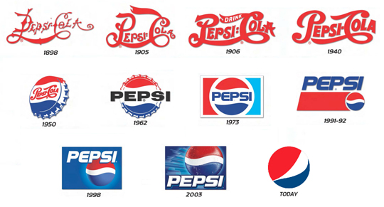
When Pepsi was launched, Coca Cola was firmly entrenched as “the” coke drink. Beginning in 1898, Pepsi had used a script to write the words “Pepsi Cola” and continued to use this motif for more than half a century until evolving into the familiar bottle cap of the familiar long neck cola bottle using the red, white and blue ribbon-like corporate coloring in the 1950s. As design and printing technologies improved in the 1970s, the design was evolved into a more pronounced emphasis on the “Pepsi” wording, having dropped the “Cola” from the name in 1962. The final iteration has been the complete elimination of the “Pepsi” name from the logo, so that it is now just a globe using the three corporate colors. Some have questioned whether this latest version is a step too far.
Coca Cola

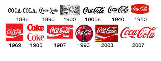
The drink was first consumed back in 1886. Back then, slab lettering was used in the logo design, but in 1887 the first script was drawn out by the then bookkeeper and the very familiar wavy Cola Cola writing was born.
The logo then evolved slowly, seeingly alternating between a plain background with clear script letters writing out the brand name, and a more colorful background with the well known brand name inside.
In 2009, the logo changed once again to be a plain background, with bold red script for Cola Cola. When looking at the black logo from the 1940s era, the similarities are eerily distinctive. It is almost as if the designers and management wanted to communicate to consumers that Coke will always be Coke, and won’t ever change (again: after the disastrous New Coke product launch in 1985).
Apple

Apple’s logo in 1976 was a consuming image that was dark and hard to visualize. The inscription on the first logo read: “Newton … A Mind Forever Voyaging Through Strange Seas of Thought … Alone.”. Interesting thought, but hardly an uplifting one for a computer company.
Thankfully, Apple saw the light of day with their logo and commissioned a new one from Rob Janoff with the remit to simplify it. What Janoff came up with was an image of an Apple, in seemingly all colors of the rainbow. Later, Janoff commented in an interview that he used a multi-color look for the apple symbol because he didn’t want the image being mistaken for a cherry tomato. It’s also worth bearing in mind that in that era many computer companies were launched using fruit names, like Apricot or Apple, so there was a lot of potential for confusion between one computer company name and another at that time.
This logo stood until 1998 when it become monochromatic, and then later the logo coloring was altered again to a gradient chrome silver. Since the first logo change to an apple design, the image of the logo has really changed very little over the years and so is very recognizably Apple. Today, the logo is on the lids of MacBook laptops, and many millions of iPods, iPhones and iPads around the world and is one of the most recognized symbols.
BMW

BMW has a fascinating history, much as Volkswagen does. BMW started life as Bayerische Motoren Werke AG (Bavarian Motor Works), as an aircraft company making planes for the German army during World War I.
After that war, the company tried many different types of manufacture but it was cars where it began to make its name.
The logo design has not changed much since the early 1920s other than a radical redesign in the 80s which really doesn’t look good today. The only major difference between the original design and the current one is the use of shadows, reflections and border edges that comes from the latest digital graphic design.
Nike

Nike started off with a confusing overlapping logo back in 1971 that included the now obvious Nike swish (tick) and the word “nike”.
The logo was later clarified to separate the word from the swish. The current logo has done away with the Nike name entirely and just replies on the globally recognized “swish” on the side of sneaker shoes the world over.
Nike is not above poking fun at themselves either. In the mid 80s, they allowed the Back to the Future trilogy starring Michael J. Fox to use Nike in their movie (no doubt product placement), with a character confused by the spelling of the sneaker and pronouncing it, “Nee kay”.
In the 90s, Nike expanded into commercials and print media with an advertising campaign that told sneaker wearers to “Just Do It.” with the “swish” symbolizing job done. The marketing message matching the logo, suggesting that the Nike brand represented people who were doers, not talkers.
Mercedes-Benz

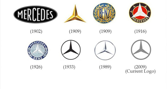
Mercedes-Benz was originally two different motor car companies that merged following the World Wars that left the German economy in pieces. The logos reflect the changing fortunes of the two companies and later the merged single entity with new branding and image.
It was not until 1926 that the combined operations began to use a logo that looks familiar to owners of Mercedes vehicles today. The logo was later simplified right down to a circle, with a three pointed star inside it that is emblazed on car emblems today.
Starbucks

Howard Schultz looked with envious eyes at the early Starbucks, but failed to agree on a business plan that served espresso drinks. In 1986, he therefore left and opened up Il Giornarle instead, but when the remaining owners decided to sell out a year later, he bought the store back.
In keeping with the mini-merger of the two retail establishments, the two logos were merged too, blending the starred crown while giving it a more modern twist, and using the bold green from Starbucks on the outer areas.
FedEx

Federal Express is an interesting case. They started out with a rectangular logo that almost looks like it was designed to be slapped as a sticker on the side of a packaging box ready for shipping.
In 1994, branding consultants came up with the genius idea to shorten the brand simply to Fed Ex. They cut down the amount of colors used on transportation vehicles to create a simpler familiar image around the world and then redesigned the logo. The FedEx logo which has remained unchanged since its simple redesign of blue and orange, with the letters shaped so that it appears that there is a right-pointing arrow situated right between the Fed and the Ex in the logo, perfectly conveying the image of a forward moving transport company that gets things done. Pure simplicity. Total genius.
Conclusion
One thing that stands out with the many evolutions of brand image that often stretch over 50 plus years is that complicated logos do not come across very well. People walk or drive past them so quickly, or flick the page in a magazine so fast that the human eye just cannot discern the details of the image quickly enough. If one has to stop to figure out what the logo looks like or what it means, then the design has largely failed.
In the successive years since launch, many brand logos gradually simplify their brand message and brand logo until they reached their latest versions. None of the logos shown, that have reached worldwide recognition, have become more fussy and complicated in appearance. Quite the opposite. So the message for graphic designers is a simple one: keep logo design simple and change it infrequently.


