You can create a pretty amazing effect using nothing but text . While images can establish an immediate context to a poster or design, you can generate a tone in a more creative way by using lettering correctly. The best example of this is perhaps 3-D typography, which has become a popular option in modern-day design. Thanks to programs like Photoshop, Illustrator and After Effects, it is now easier than ever to make your own, as well.
Each type of 3-D text will be a little bit different, with a specific focus to the design putting it within a sub-category of typography. For example, you might make one meant to be retro in style or perhaps one that is seasonal using a physical representation of a holiday or event. This singles out the typography more than as just a three-dimensional construct.
If you want to learn how to do some of your own, check out these 10 excellent 3-D typography tutorials that can give you plenty to work from in the future.
SadMonkey’s 3D Toy Text Tutorial
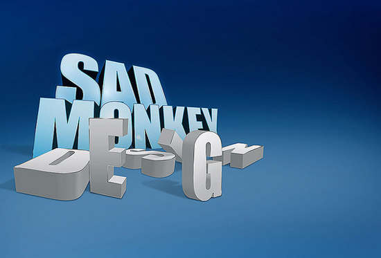
Movies like Toy Story 3 manage to continually delight audiences of all ages. The font that came from the poster and logo of this film has been used with great success a number of ways, sparking recognition without forcing an image into a niche. This tutorial will teach you how to create your own 3-D toy text for any project.
View Tutorial
Create a Dream Design With 3D Typography
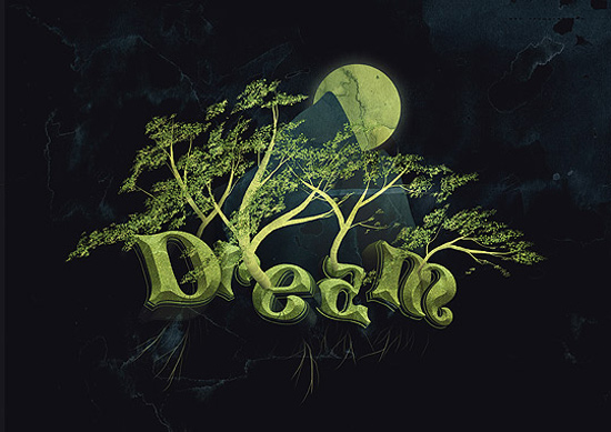
If you are in the mood for something a little bit more surreal and creative, you will love this text. It uses a dreamlike whimsy that brings to mind Tim Burton or even animators like Hayao Miyazaki.
View Tutorial
Create a Spectacular Grass Text Effect in Photoshop
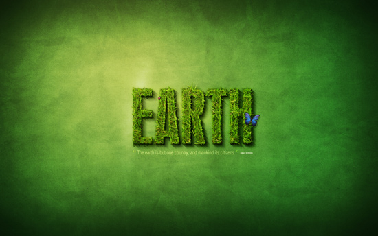
Feel like going green? If you are looking for something nice and down to earth, you will enjoy this interesting little typography that uses realistic-looking grass to make up the lettering. They are slightly raised, appearing almost like some kind of hedge. The creative use of shadows provides additional depth.
View Tutorial
3D Cliff Text
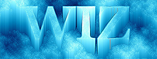
Giving a futuristic and bright-looking effect, this one is a little hard to read because of the glow. But it is manageable and really cool and could be changed to another color or darker shade to harden the edges enough to read more clearly. It is definitely a dramatic bit of typography and perfect for something that has to really stand out.
View Tutorial
Awesome Milk Typography Effect in Photoshop
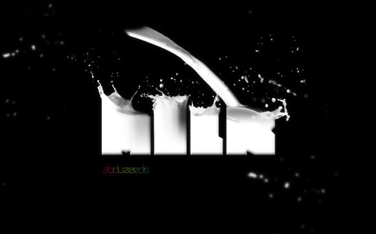
Got milk? You do now, with this cool little 3-D text that makes it look like shaped glasses are being filled by splashing liquid. The little details in this one are the real joys, with the drops of milk flying off of the actual lettering and the spray off the top.
View Tutorial
Colorful Light Burst Text in Photoshop
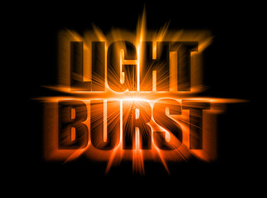
This is a great little text that seems to be modeled from modern movie trailers, where a light burst effect is common in sci-fi or action flicks, especially. The central brightness with the dimming around the edges of the outer letters is a nice touch that keeps it from becoming too overwhelming.
View Tutorial
How to Quickly Create a Stylish Retro Text Effect
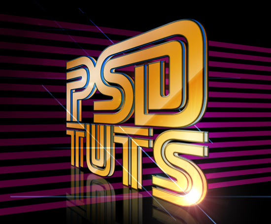
Retro is always in style, and this text manages to capture the best of the ’60s club glitz with a touch of modern design flare. The reflection creating a dual glass look adds depth, while the stripes in the background make a great eye-tease look when you reach the bottom of the picture.
View Tutorial
Kaboom! Exploding Text
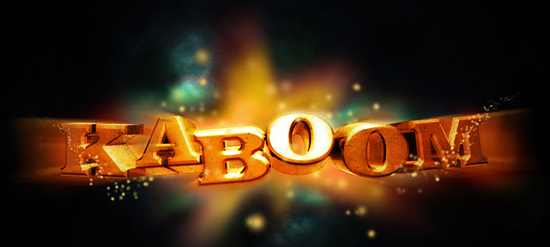
Sometimes you just want something fun, and this tutorial is definitely that. It is a great, gilded lettering with plenty of shadow and detail, but with no direct purpose besides the mysterious explosion effect. There is no source of the apparent ignition, making it look like it has expanded from space with no cause.
View Tutorial
A Nice Popup Papercraft Text Effect
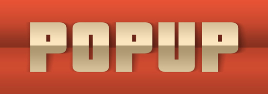
Who can forget the pop-up books we used to read as children? This text uses the same paper effect with the letter, using a fold down the center to create two points of reference for the lettering. The overlay gives it a 3-D effect.
View Tutorial
Stunning 3D Effects in 30 Minutes
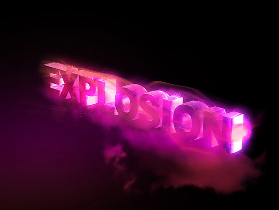
This text looks like it came from any electronica band cover of the ’90s. It uses a great mesh of color to give it a cool feel, without overdoing the blue like so many other chilled graphics. The details around the letter are more fascinating than the font itself.
What are some of your own favorite 3-D text tutorials? Share them below.
View Tutorial




That milk typography indeed looks awesome. Thanks for the list. 🙂