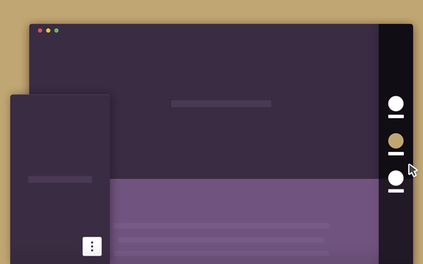
This is a smart vertical navigation tutorial with round indicators that turn into labelled icons when the user interacts with them.
The basic idea behind putting round indicators on the side of a web page, is to give a hint to the user about the number of sections she/he can go through. We think of each dot as a content chapter, with its own title. Usually, users have to hover over a dot to access the title.
Users don’t need to select a specific dot/item, but just move to the side, thus showing their willingness to access the navigation.


