You know packaging can easily take a step further a product. A beautiful, eye catching but especially functional packaging design can make it sell more. Packaging a product the right way entails much more than just creating a box to put your product in. At Custom Boxes Now we know it’s important to understand the evolution of the package because now products are using the packaging as the primary sales.
Standart packaging is dying day by day so designers are working (students too) for new design styles to stand out from the crowd in this competitive world.
Here are some examples of beautiful packaging designs around the world. Although a few of them have been designed as a concept they may come into life in the following years.
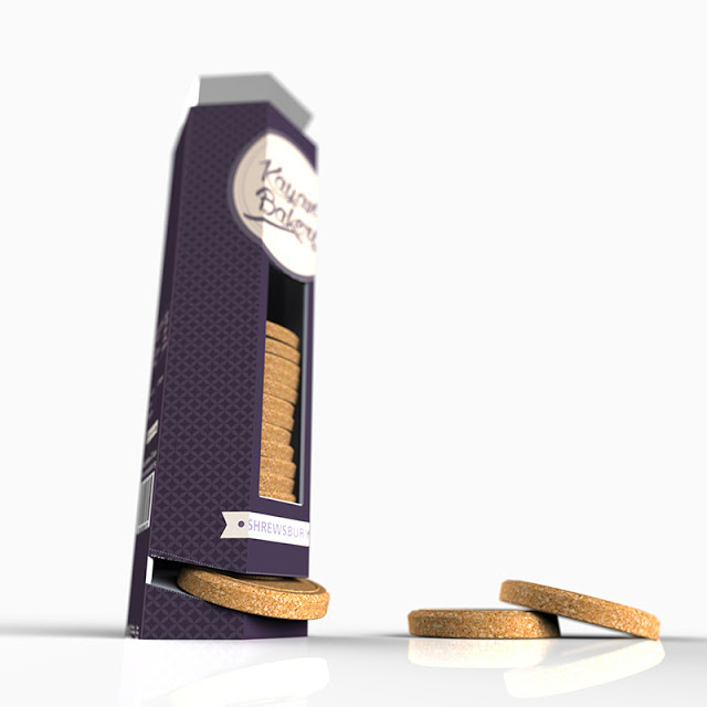
The Biscuit Pack
The Biscuit Pack is a concept that aims at enhancing the user’s experience of having tasty shrewsbury biscuits in a exclusive premium packaging.
 Source
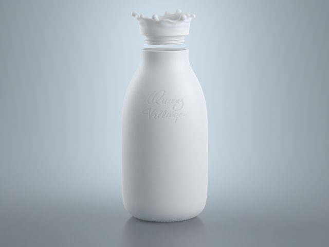
Milk Bottle Concept
The main idea was keep the bottle as simple as possible but add some liveliness.
 Source
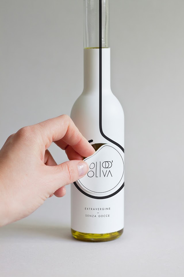
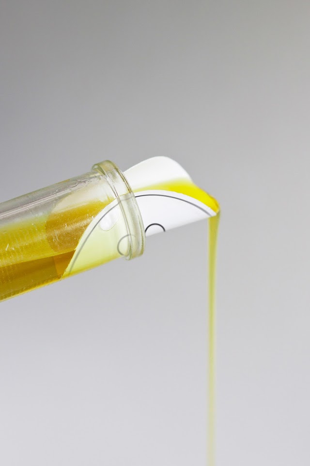
Olio D’Oliva
It is smaller than the common bottles and has a very simple and cheap anti-drop system integrated in its packaging. A circle can be pulled-off the packaging and be used for pouring the oil without dripping.
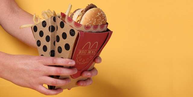
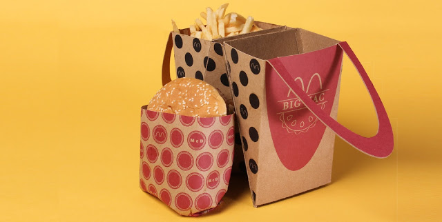
McDonald’s Big Mac
Its goal is capture the simple delight of a child opening up a Happy Meal, while understanding that reality is often hectic and complicated.
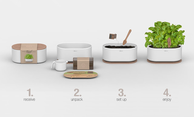
Urban Oasis
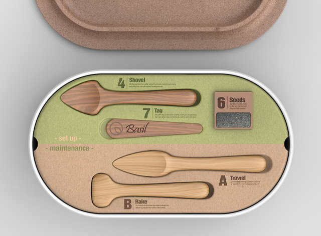
The package includes a pot, dried soil+fertiliser, gardening tools, seeds and a watering can. The pot, with its modern and minimal look, was designed to fit perfectly both on a balcony or indoor.
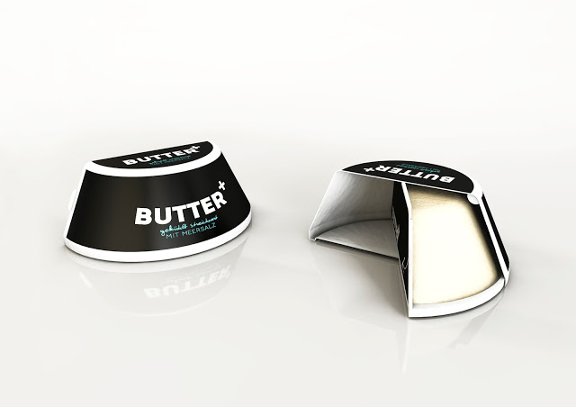
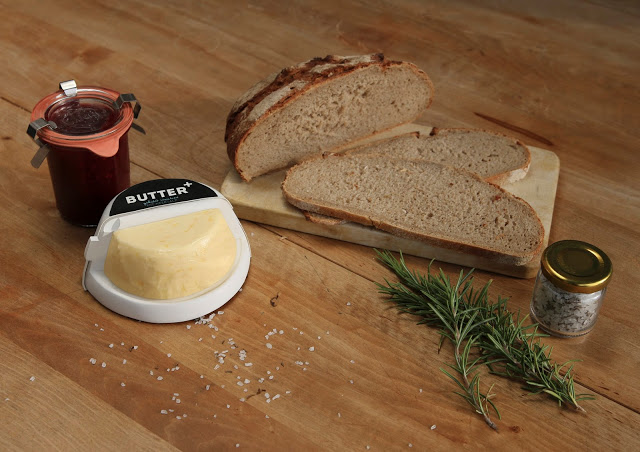
Butter Plus
By using two injection molded pieces you can easily open, reopen, swing around, and close the butter.
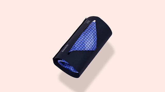
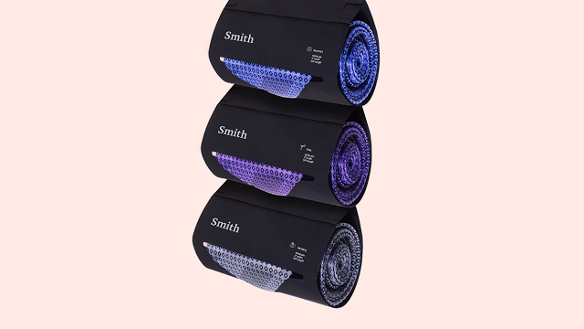
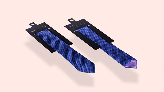
Tie Package
The tie package consists of one piece of paper that can be rolled or kept flat to store men’s ties. The package contains no adhesive, therefore, it’s easy to stack and assemble.
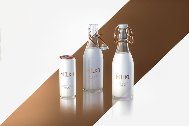
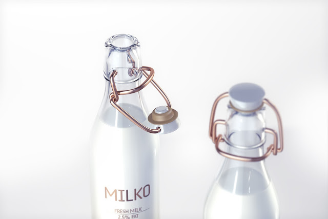
MILKO – Premium Dairy Products
The main mood is luxury and it comes from dark red gold and white milk.
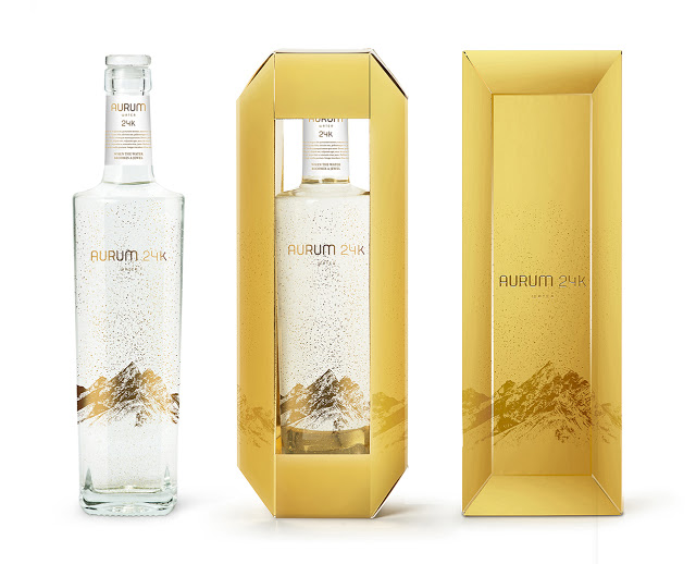
Aurum 24K
The concept was to show snowy mountains on the bottle, which are the origin of the water, but with GOLD sparks falling from the sky and laying on the mountain instead of snow, turning upside down the usual image of the mountains in the water industry.
 Source



Beautiful package designs I liked the the biscuit pack and the tie package designs.