When you develop a website there is a lot you are probably worried about getting right. The overall design, the information within the content, any carts for ecommerce, the SEO and marketing – it is all very important. That is why the majority of your time tends to be dedicated to these areas.
But there is one factor that too often goes ignored, and that can have a major effect on the results you get from your site: the user experience. If visitors don’t feel that their experience has been enjoyable, enriching or helpful, they probably won’t return. You have to catch their attention, give them something exciting and keep bringing them back.
A website should be addictive. You want subscriptions and frequent returns, which means giving them plenty to desire. Here are five examples of websites and application interfaces that have managed to generate a creative, exciting and impossible-to-resist user experience.
Gowalla App

Gowalla is one of a number of highly popular applications based off of websites to hit the iTunes market. The content is an experience in itself and is the main reason that users go crazy for it. But that isn’t the only part of the experience that is appreciated.
One of the best features that enhances the whole design is the refresh method. There is no reload button like you would expect or even a menu for selection. Instead, you utilize the touchscreen by pulling the page down. This refreshes the app, which is cool, interactive and simpler than finding something under an active link to press. Gawalla isn’t the only app that uses this, but it was one of the first. You can also find it on Foursquare.
Convertbot App

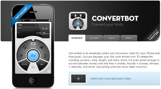
This useful little app sells itself, just as an excellent conversion tool. It is one of the few that provides users with the ability to mix and match their converted units, such as Pounds + Ounces or Gallons + Liters. But it created something all new when they made their interface.
The menu, instead of being a standard list, is a circular chart. User can slide through them to find what conversion tool they need, and the different style of unit shows with small icons. It is very attractive and actually fun to use. It’s also an example of how people are changing the design basics thanks to touchscreens.
Strong Bad Emails

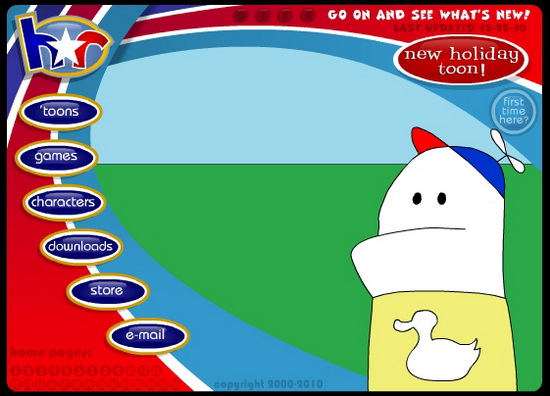
If you have spent five minutes on the Internet, you have come across the brilliant web cartoon Homestar Runner. If you haven’t, you are about to, and your life will be better for it. One of the characters is Strong Bad, and he is well loved for, well, everything.
Now users who are fans of the show can email him, and he will answer those emails – or at least some of them – on separate webisodes. They are funny, sarcastic, insightful and just as good as the full cartoon from which it is a spin-off. It is an amazing way to have established an interactive network with viewers, which immediately goes viral.
IconDock

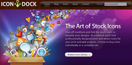
Maybe it is because Apple effectively rules the world, but you are seeing a lot more of the features well known on Mac products being applied elsewhere. IconDock is a good example. This is an online store where you purchase the rights to icon designs to use as stock.
Rather than clicking a button to add it to the cart, you get to drag and drop the little icon into a sidebar, where it prices it for you. It is like putting the icon on one of those grocery store conveyer belts at checkout. Then it stacks the icons for you so you can see everything you have bought.
2OTSU

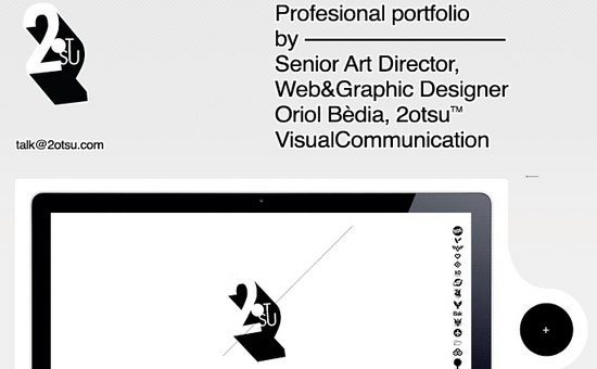
How cool would it be if you got to customize all of the websites you frequent so they have either Flash or HTML, the color you prefer for the background, and an ultrafast scrolling option that works like a touchscreen, only with a mouse? This site has all of that and more. It really shows what can be done when you are concerned with user experience, and it is fun going through all the little options as a visitor.


