Every year, various new web design trends appear. The year 2016 hasn’t been an exception. While many of the ways web design is executed now has evolved over the last few years, several new trends have also emerged. These trends have shaped the web design world during the course of the year 2016. And many of them are likely to continue ruling the roost in the world of web design in the years to come as well.
Here’s a quick look at some of the most popular web design trends, which have succeeded to make a comprehensive mark in 2016 and are expected to stay for a long time.
– Card-based web design
– Design for screens of multiple sizes
– Use of hero images
– Leaning towards app design
– Google’s Material Design
– Stylish and easy-to-comprehend fonts
– Motioned backgrounds to websites
Card-based Web Design
 What was the most important web design trend that emerged in 2016?
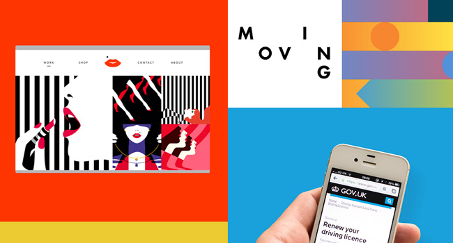
It surely was the card-based design. This form of web design has also become popular as container styled design and is being used by designers extensively.
The use of cards became increasingly popular towards the end of 2015 and the beginning of 2016. With Pinterest becoming extremely popular, other websites were also influenced by the style it had embraced. And it was completely card based.
This was one of the most significant changes that was initiated in the world of web design, as the number of mobile web users crossed their desktop counterparts comprehensively.
Design for Screens of Multiple Sizes
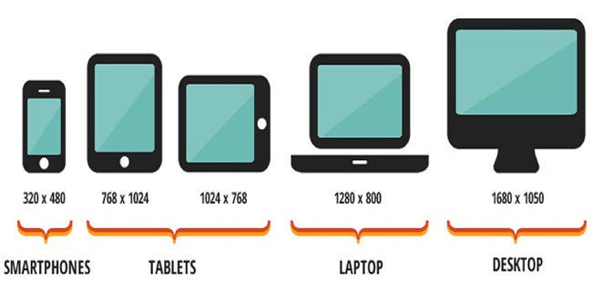 The use of the internet is no more limited to desktop computers. Mobile and handheld devices are becoming increasingly popular. So, the web design universe has also diversified accordingly. With every passing day, this world is becoming increasingly connected. So, web design has become more responsive. That is, most of the websites are being designed in such a way that they are displayed in the best possible manner through desktop as well as handheld devices.
Use of Hero Images
 Heard of hero images? They are the call of the day in the world of web design. Almost every website is having a large and distinct image, which is able to attract the attention of the audience. In many cases, a high-definition image is also used for this purpose. The image contains a call to action, which can be used to increase conversion. Although it would have hampered user experience earlier, with increased bandwidth and internet speed, the use of the hero images have gained prominence in the field of web design.
Leaning Towards App Design
 As mobile internet is becoming increasingly popular and web design companies are also designing keeping that in mind, more and more apps are being designed. Almost every service is being represented by apps. As apps are meant for mobile devices, which usually have small screens, web designs are being made compatible for micro screens. And for that, it is being made more and more simplistic. In fact, minimalist designs are gaining more ground with every passing day. And the app design has given rise to one of the most important forms of design these days – the card-based designs.
Google’s Material Design
 The year 2016 initiated the shift of the world of web design towards minimalism. And that was taken forward by the material design initiated by Google. It is a form of flat design, which ensures that the design is performed in the minimalistic manner. While it included the card design, material design also took the card design forward by bringing in a new dimension in web design based on the use of cards. Besides, in an effort to go for minimalistic approach, it also uses flat icons for designing.
Stylish and Easy-to-Comprehend Fonts
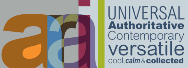 With websites becoming more and more simplistic, it is on the fonts to express what you want. So, the use of dramatic fonts have become more and more common these days. It is important to use types of fonts, which can convey the mood of the writing. However, all these will be delivered through fonts, which are minimalist in the true sense of the term and also quite easy to comprehend.
Motioned Backgrounds to Websites
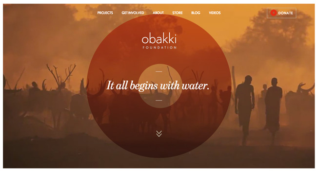 After 2016, web pages are not going to be the same any more. The evolution of the design of web pages have been fabulous. The background for web pages used to be white or light colored during the early ages of the web and afterwards, you could include text on images. However, video backgrounds were not quite common. While it was gaining ground since the last few years, the trend gained maximum momentum during 2016. Background videos have become extremely popular and a lot of website owners are including it to make the sites more attractive for the visitors. However, it’s a must to keep the web page background videos mute. Another form of web design that has emerged and helps to add motion to the website backgrounds is Parallax Design.
Conclusion
The year 2016 has been experiencing the emergence of a number of web design trends. While some of them might wane away, many of them are surely going to stay on. Many of the web design trends that have emerged in 2016 are going to give a new look to the world of web design in the years to come. Several of them are going to get a new avatar and be used in the design of websites in new forms.


