Web design plays a crucial role in determining the conversion rate for an internet startup. In fact, web design can make or break the success of a website’s entire acquisition strategy. Good web designers know what works and what doesn’t. Good designers design to convert!
With the end goal being getting users to sign-up for a product/service for the first time, what are some of the design growth hacks you can employ to increase and sustain conversions? By taking a look at the online properties of some startups that have experienced significant success in their digital strategy, we can easily identify key trends that enable web design to contribute significantly towards a startup’s growth.
Following are 5 major design growth hacks that can make a startup win big and experience a higher and more sustained conversion rate.
Focus on the Headline
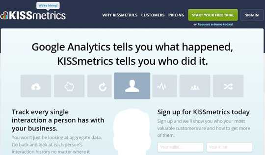
This sort of extends out of design realm and into copywriting. But as the web designer you want to make sure you’re incorporating a nice big portion of your website for a punchy headline that your copy writers can help you create. The idea here is to be able to communicate the specific value that a user will get in return for the attention you are demanding.
Clear Call to Action
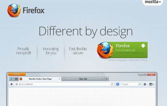
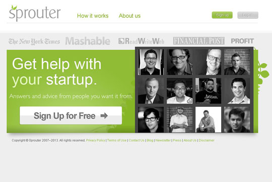
Once again, extends out into the copy writing world but as the designer you need to make sure this call to action is placed in a prominent location. The preferred location is as close to the headline as possible and viewable within the first glimpse. Amongst best practices utilized by startups is to utilize a spot color that is different from the rest of the website to make the call to action stand out with design. Using CSS for action buttons also helps produce faster loading time.
Impactful & Meaningful Visuals
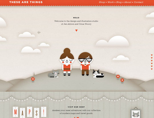
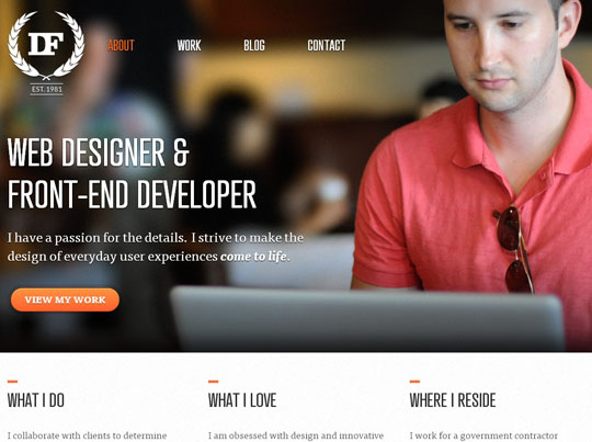
Visuals work wonders for conversion. However, there is no real point in having the prettiest of graphics or the most amazing photographs on your website if they do not mean anything. The objective with dedicating a space for a visual on your home page is that it should instantly be able to communicate the value you are delivering and support your case in the first few seconds.
Multiple tests have shown pictures with people smiling or videos tend to convert best. However, this needs to be placed into context for each particular startup.
Social Proof
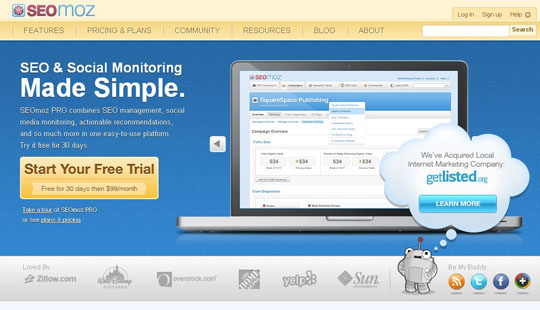
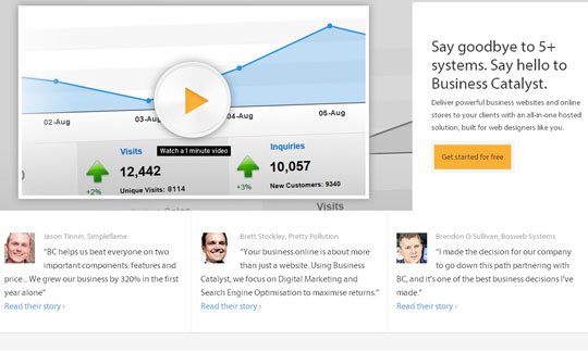
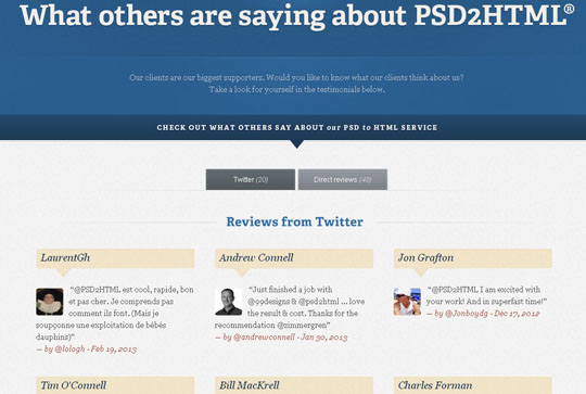
Dedicate a space on your home page that gives new users a sense of the social standing of your company. This is not restricted to just social media statistics or mentions in the form of a Twitter feed or Facebook like box. Customer logos, press mentions, user statistics and testimonials all fall under the umbrella of social proof and can be incorporated on your website.
A/B TESTING Variations

Testing multiple variations of your home page or other landing pages on your website is a crucial yet often overlooked aspect. Successful startups however, know that you can’t let go of the designer without having him create multiple versions for testing purposes. Effective A/B testing ensures your web design continues to get more and more effective in terms of converting users. You’ll be surprised how big an impact the smallest of design changes can have on conversions.
Approaching web designing for startups with these key points in mind will enable you to design for a higher sustainable conversion rate and take credit for helping growth hack the startup you are designing for.

