Responsive web design (RWD) is arguably the hottest topic in web design today and perhaps it has taken the user experience world by storm. But what exactly it is?
RWD is a set of techniques that allows a website to present its content well to almost all the users, no matter what sort of device they use, may be a mobile or tablet or desktop. Alas, web designers are gifted with some beneficial resources such as CSS frameworks to help them in creating digital products in some exhilarating ways. CSS frameworks are pre-prepared libraries that help to simplify standards-compliant styling of web pages using Cascading Style Sheets (CSS) language. Using CSS framework, a web developer can design a perfect website with clean grid structure, impeccable documentation and tutorial of site structure. The top CSS frameworks for responsive web design are:
Foundation
 Foundation is a 12-column CSS framework that helps you in building prototypes and production on any kind of device. This easy-to-use, powerful and flexible framework comes with dozens of user-friendly styles and elements.
Less Framework
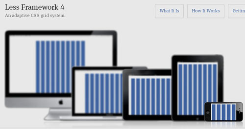 Less Framework is a CSS grid system with which you can do wonders to your website’s flexibility and adaptability. It features 4 layouts and 3 sets of typography presets, all based on a single grid.
Golden Grid System
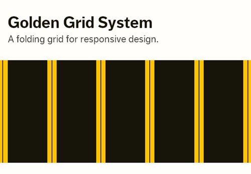 Golden Grid System splits the screen into 18 even columns. Out of the 18 columns, 16 columns are used for designing and the remaining 2 are the rightmost and leftmost columns which are used as outer margins of the grid. The columns feature elastic gutters and a zoomable baseline grid.
Responsive Grid System
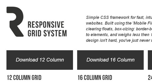 With Responsive Grid System, you can create responsive websites with great ease. This fluid grid CSS framework is available in 12, 16 and 24 columns. Break points are set in for manifold resolutions and it offers clearfix and optional reset.
Skeleton
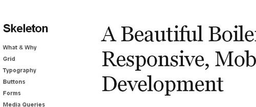 Skeleton was one of the earliest and the best responsive CSS frameworks that enable you to develop eye-catching websites at any size, be it a laptop screen or an iPhone. It is built on three core principles – responsive grid down to mobile, fast to start and style agnostic.
Ingrid
 Ingrid is a lightweight and fluid CSS layout system which aims at minimizing the use of classes on individual units. It is also meant to be an extendable system and can be easily customized to suit your own needs.
Titan Framework
 Titan Framework is a new responsive CSS framework that has been designed based on the 960 grid naming convention. It helps you in creating responsive layouts that adjust to any screen resolution at maximum width.
Gumby
 With Gumby framework, you can customize and mould your grid to fit your needs. Also, it can be easily adapted to any screen size or resolution. This framework is packed up with tons of prebuilt styles and common interface elements like forms, buttons, tabs, toggles, drop downs and more.
Amazium
 Amazium lets you to handle the trickiest and time-consuming parts of creating responsive websites with ease. With this CSS framework, you can take advantage of large displays and it even provides support for retina displays.
320 and Up
 320 and Up comes with a responsive layout system that thwarts mobile devices from downloading desktop assets by using a tiny screen’s stylesheet as its starting point. It contains five media query increments, a vertical grid, preset styles for typography and components from HTML5 boilerplate.
With all these top responsive CSS frameworks, I am sure you can kick start your responsive website project right now.


Nice list of frameworks but as a big bootstrap fan, I miss it here. 😉
Keep it up!
Surprised Bootstrap was not included in this roundup.
Hi
I love http://www.responsivegridsystem.com/, but I would, I wrote it!
Would you have a look at it, and consider adding it to your list?
Thanks
Man… no Bootstrap here!? WTF!
Nice lists of frameworks! I love using frameworks for designing some of my projects, but we are all aware that not all people loves using a framework, hmm… well never mind that, its out of place. With the rise of RWD, these frameworks will definitely save a lot of time in coding. I have used bootsrap which is a great framework, why does this one isn’t included? By the way, a nice list though! 🙂 Will try some of them!