When you are designing a site you have a hundred little details to keep in mind. But it isn’t all about concept design and launch. It is also about making sure whatever you create has the maximum web accessibility possible for your users. Which is a whole other set of guidelines you have to follow, apart from the design process itself.
Don’t get caught making common pitfalls. Check out these five excellent infographics on web accessibility from top designers in the game.
Web Accessibility for Designers
 View Larger
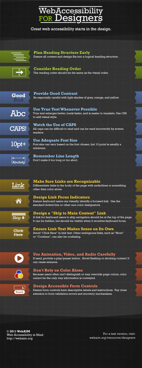
WebAim is a Utah State University based organization dedicated to creating an accessible online world for people with disabilities. In this inforgraphic , they not only explain the ins and outs of accessibility in web design, but they endeavor to show it in practice. Placed on a beautiful grid background, they talk about reading order, contrast, links, font and more. All using moderate colors that show us that you don’t have to go with bright and flash to get your point across.
Accessibility Challenges In Email Design
 View Larger
Addressing a challenge often skirted over by design blogs, this typographic uses a retro infromation pamphlet look to talk about the different kinds of disability you will encounter (Visual, Physical and Cognitive/Neurological), and provide helpful statistics on each. Then, they give an eight point breakdown of how to make sure accessibility is handled in emails. They cover one issue that you rarely see, which is harmful content. This includes flashes, patterns and video/audio use that can cause seizures in people with conditions such as epilepsy.
What Is Web Accessibility? Infographic
 View Larger
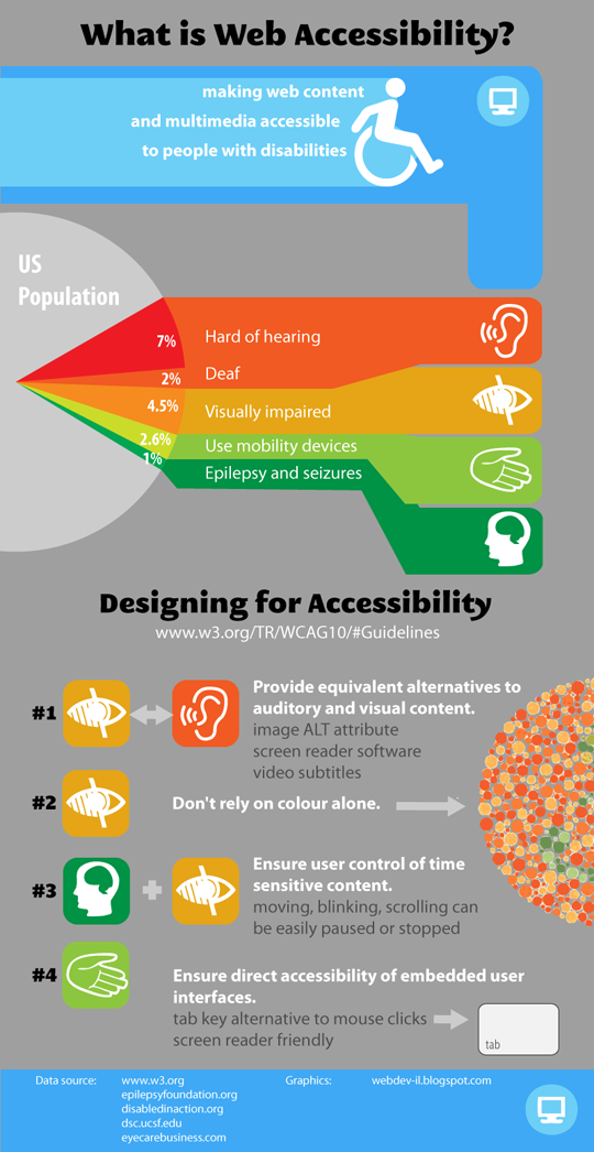
This is an extremely simple infographic that provides a quick four step system for avoiding pitfalls with creating accessible websites. They provide a couple of stats, but mostly keep it about maintaining the highest viewable level for users.
Anatomy Of Effective Web Design
 View Larger
This is a highly complex infographic about the breakdown of overall effective web design. The tips and information it provides make is useful for all accessibility, not just for the disabled. It shows you how to come up with a simple, effective design that anyone can view without problems, and so reduces the amount of work you have to put in to creating multiple web page formats and layouts.
Color Contrast
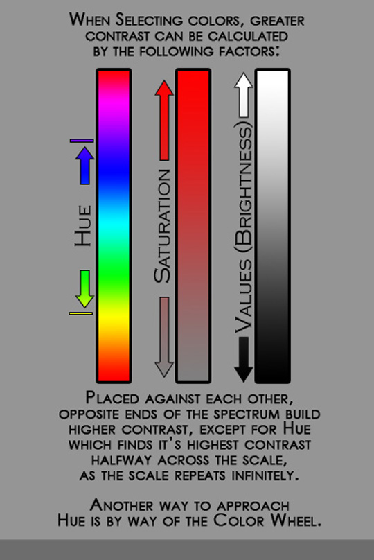
Showing the difference between high and low color contrast, and giving tips on using the best tones for your sight’s accessibility, this is a fantastic little infographic about color specifically. This is an important element to design, as those who have vision problems, chronic migraines and colorblindness will have to rely on you to provide them with a site they can easily and safely read.
Conclusion
You should always take these issues into account before starting a design, because a fair percentage of your viewers will have impairments to overcome. What are some of your favorite infographics in this area? Let us know in the comments.


What is true text?
“true text” is text that’s not a graphic. A lot of the header graphics and logos on web sites are a picture of text (in .gif, .jpg or .png formats). Text that can be selected with mouse or keyboard letter-by-letter is proper text. If the square around the text gets selected as well, it’s most likely a graphic, just a picture of text.
I think it’s interesting that only one of the graphics addresses the issue of keyboard functionality. Not using a mouse on a web page is a very simple test for assessing accessibility.
The Web designer salary range in the last one.
a – implies more people get top of the range.
b – it goes up to 64k, where the male female gets to 50k, are all the people in the 50-64k without gender?
sorry… second to last one, with WDL on the bottom
Infographics. About Accessibility. That don’t have text alternatives. Priceless.