Font pairing is a big component of designing with fonts. This is true whether you’re designing a file for personal use, for a work presentation, or for branding purposes.
Font pairs look effortless when you see them incorporated into wonderful designs. But if it’s your first time pairing fonts, you’ll find that there’s an art to it.
Some fonts just look great together, while others are a match made in design hell. Other font combos may look okay in theory, but overall don’t seem to carry a charm that catches people’s eyes.
If you have limited experience with fonts or are intimidated by the prospect of font pairing, this is the article for you! In this blog, you’ll find practical tips that you can use when choosing fonts to pair. Plus, we’ll show you font pairing examples with free and premium fonts you can download from Creative Fabrica.
Familiarize Yourself with the Most Common Font Types
Before diving into font pairing, your first order of business should be to learn the most common font types used in design. These are: serif fonts, sans serif fonts, script or handwritten fonts, and display fonts.
Serif fonts
Serif fonts are fonts with serifs, which are those tiny lines or strokes at the ends or edges of letters. Serif fonts are considered the more traditional fonts, the serifs lending this typeface a sort of serious personality.
Sans serif fonts
Sans serif fonts are fonts without serifs (sans is a word that means ‘without’). Compared to the serif font, sans serif fonts are typically seen as the more modern, its lack of serifs giving the typeface a much younger appearance.
Script fonts
Script fonts are fonts that mimic cursive handwriting. A subset of script fonts, handwritten fonts, are fonts that mimic block or print lettering, with most of its characters unjoined. They lend a more human touch to designs as they are the closest in appearance to human handwriting.
Display fonts
Display fonts are fonts meant to be displayed. They can be serif, sans serif, or script fonts. They have extra embellishments and are best used in large format designs such as signages, posters, and big displays. They have a ton of personality.
Each of these font types will have varying personalities which you’ll need to keep in mind when you incorporate them into your design. Their legibility will also differ from one another, with serif and sans serif fonts your top picks if legibility is your priority.
7 Tips on Pairing Fonts
Creating eye-catching typeface combos may be tricky, but you don’t have to go into it blindly or take a whole college course on it! Here are a few guidelines that you can easily follow when pairing fonts for your next design project.
-
Pair different font types to create texture
When looking for fonts to pair, the simplest route is to find fonts that, when combined, create interesting texture.
You can achieve such texture by pairing fonts that complement or contrast each other. You will see this if you pair serif and sans serif fonts. Script fonts paired with the more legible font types also have an eye-catching look.
-
Combine a maximum of three font types
As a rule of thumb, you’ll want to stick to a maximum of three different font types when combining fonts in a single design. Any more and your design will run the rise of looking cluttered and confusing.
-
Use the same font with different weights
If you’re having trouble finding font pairs, oftentimes the secret is within your primary font itself, or rather its font family. Many fonts are designed with different font weights and widths, and combining these achieve texture in a more subtle and minimalist manner.
-
Relegate script and display fonts to titles, single words, and logos
Script fonts and display fonts are the less legible fonts of the most commonly used typefaces in design. They’re readable when used for single words or short phrases, but if you’re designing blocks of text, you’re best off with a serif or sans serif font.
-
For blocks of text: use serif for print, sans serif for web
The serif on serif fonts aids in readability by guiding the eyes towards the next characters. They’re less used for online or digital reading, as computer screens typically don’t display serif fonts well, at least in the Web 1.0 days.
-
Pair fonts in the same typeface family
This is a little tricky because you wouldn’t want to pair fonts that look too similar. In this case, keep in mind the guidelines for achieving texture: pair fonts with contrasting weights and varying stroke lines.
-
Keep your fonts to their specific assign roles
When pairing fonts in a text-heavy design, you need to decide which fonts are used as header fonts, which ones look best for text blocks, and which to use to create emphasis. Not only does this make your design process easier; it will keep your design looking polished and professional.
20 Font Examples to Combine + Font Duos (Free & Premium)
Below we’ve provided examples of font pairings that look harmonious and eye-catching when used together. We also have a few font duos, which are fonts in different font types that are designed to look good together. All the fonts listed in here are all available on Creative Fabrica.
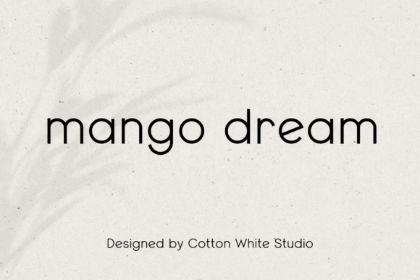
Both fonts are elegant on their own, but even more so when they’re paired together. The script font has enough drama on its own, so you’ll need a very subtle and dainty serif font to achieve balance.

The serif and sans serif font combo is always an easy go-to. Their varying stroke weights achieve instant contrast, while the sans serif gives the pair a contemporary touch.
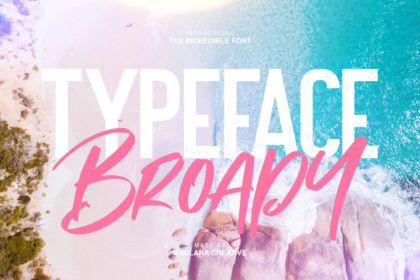
The solid look of the chunky sans serif font is balanced by the thin strokes and narrow width of the script font paired with it. Together they have a fresh modern look that’s also very stylish and trendy.

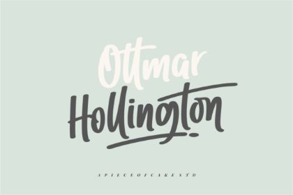
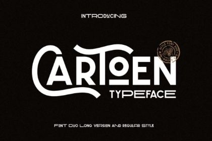
Both fonts have a very traditionally romantic vibe, so pairing them is a no-brainer. This is a type of font pairing that looks timeless in its elegance.

Both these fonts own fresh and vibrant personalities, so it makes sense why they look great together.
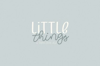
Both fonts are handwritten fonts, but they look good together because they have contrasting styles. Their casualness, however, fit well together, creating a highly personalized and youthful touch to a design.
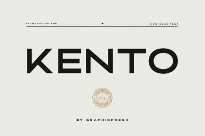
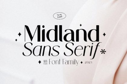
Both fonts have a very contemporary feel to them, which is why they look so good together. Their contrasting widths adds visual interest, so the pairing looks quite eye-catching and stylish.

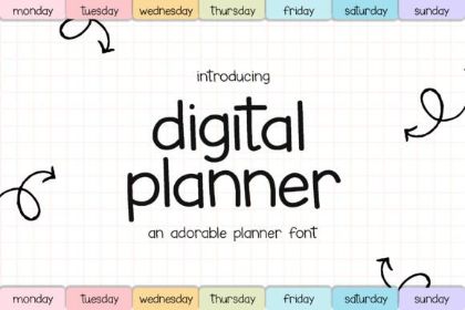
The two fonts when matched together achieve a young and friendly look while remaining chic and classy.
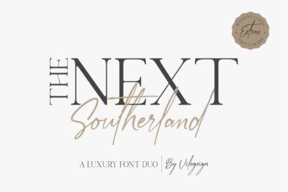
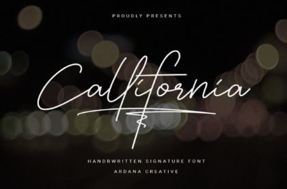
When you pair a serif font with thin strokes and sharp serifs with a haphazard script font, you get a very stylish and contemporary vibe reminiscent of luxury brands.
The two fonts are a combination of handwritten fonts in block and cursive. The similarities in the shapes of the characters give the duo a cohesive look without looking stale or uninteresting.
This font duo features a regular sans serif paired with its more playful distorted version. The exaggerated version adds interest, while the regular one keeps your whole design more put-together.
Combining handwritten fonts with condensed and bold sans serif fonts adds a dash of modern spunk to any design.
Pair Fonts to Create Interesting Designs
Pairing fonts may seem tricky, but once you get used to this practice, you’ll be able to find pairs intuitively. Having an eye for fonts and font pairs takes time and lots of experimentation. To find the perfect ones for your designs, get input from great designs and find out what makes them work, and then try to apply those principles on your projects.